Top 05 Trends In Logo Designing For Women-Founded Businesses 2023
Are you looking for the top trends in logo design? Which are some of the top logos by top companies? Who can help you with the best logo designs? Do I need to hire a logo designer? We have cleared all the questions that you are looking for. This thing will help you with the best logo design. Read here to know all the points to have an effective logo for your company.
Several types of research conducted by the entrepreneur community show a bond between gender and entrepreneurship skills. The survey indicated men are 2x more likely to generate $100k funding as compared female entrepreneurs. Studies also reveal that female parent entrepreneur are capable to generate 19% of funding as compared to 27% of male parent entrepreneurs.
These studies prove to be an eye-opener in ascertaining the funding gaps which exist. But many female-led businesses and companies have marked their presence in the market and bridged the gap to a lot of extents. We have analyzed the logo of some of these female-headed and found that has been successful.
Which are those trends in logo design? Let us discuss:
- Blue is the color of supremacy
According to the survey conducted by corporate logo design experts, blue was one of the most dominant colors amongst the 50 female-founded and funded companies., with 32% of them choosing colors with a cool tone such as blue as their primary brand color. Blue is the cream of a colorful crop when it comes to logo design.
It was a surprise to see a variety of sectors opting for blue. Beyond the traditionally blue sectors such as health care, accounting, technology, entertainment, and real estate it is seen that blue is widely used for logo design across Advertising, FinTech, and BioTech.
It was observed that almost 44% of the blue logos which were analyzed used darker shades of blue. Brands like Outdoor Voice and Heavenly use almost blackish blue for their brands. Designers from business card logo design in India share their view that moving towards more of a darker shade of blue towards black, gives logos a more chic feel and allows to maintain a sense of affordability. Establishing such kind of traits before a funding round can help in crystallizing the brands in the eyes of venture capitalist
- The combination marks are a go-to
Around 68% of logos that were analyzed used a combination of marks such as pictorials, abstract or symbolic elements used along with typographical wordmarks, which relate this with Burger king. Bigger tech giants have seen opted for this type of logo design, which uses symbolism to visualize their brand along with their watermark.
Some of the examples are:
One of the interesting things that came into light in this study was that none of the 50 companies under the study went for a stand-alone pictorial mark somewhat similar to Apple. Also, 30% of female-funded companies opted for a watermark without any iconographic elements. Professional flyer design services associates highlight such kind of name recognition is important in the early stages of business to make it easy for people to recognize the brand and connect with it. Various kinds of promotional and branding opportunities are taken into consideration such as banners, flyers, etc. to make it easy for people to remember and associate. If the brand needs to make its reputation steady then it should constantly remind people of what the brand is all about.
- Flushed tones- ideal for tools and collaborations
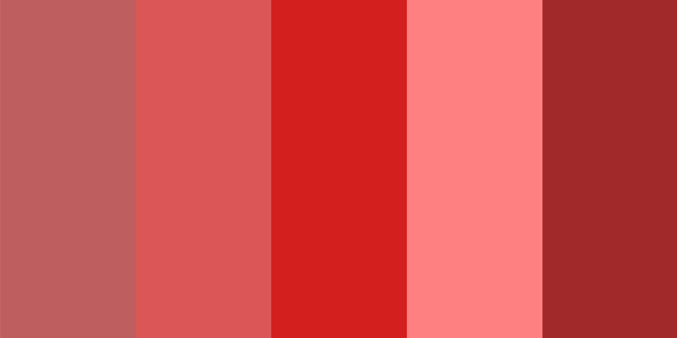
It is seen that colors like red and pink are widely used by bigger companies that are involved with creating tools that facilitate better collaboration and better insight. For example, a company like Knotch uses a vibrant shade of pink for its logo. The brighter hues are attention-grabbing and playful which is a perfect way to put the best foot for the marketing channels of the company whose value proposition is fun and easy for the audience to share their feeling about the brand.
Also Read: Unique Logo Design Trends To Checkout In 2018
The front app is a company that is using a shade of coral red which gives a very playful, youthful, and modern character. This gels up very well with a friendly and modern brand that facilitates collaboration.
- Biotechnology brands love patterns and repetition
In 2017, big brands specializing in the biotechnology sector used clever patterns and repetition. A good example of this company is n of one, which uses a distinctive dark greyish blue and burgundy red pattern to signify its specialization in the world of molecular tests. The pattern treatment of their logo relates to their sector while giving these brands a fresh visual identity.
- Sophisticated and accessible brands choose black
Choosing pure black speaks a lot of volumes for the brands. The color conveys luxury, modernity, and a sense of high-end consumer goods or services. The best example is Gwyneth Paltrow’s Kooky which is an aspirational health community that uses a classic black color typographic logo on plain white background. The black color gives the brand appearance much simpler and more modern.
Conclusion
The study indicates that female-founded companies not only do exist but are giving real tough competition. We have seen that blue is still a much favorite in the world of logo design. It seems exciting for young, modern brands to experiment with different colors and styles. The business is doing great and they are expected to reach even greater heights with these color trends in logo design.
VerveBranding can be your one-stop solution for branding and designing because we have decades of market experience and a team of experts who, over the years, have worked on many major and minor projects for all types of industries. We provide designing and branding services at the most affordable price. For services related to mobile app development or web development and online marketing services, check out our subsidiaries, VerveLogic and VerveOnlineMarketing. Connect with us right now to have the best services in logo design and branding for your business.

