Creative Landscaping Company Logo Design Ideas
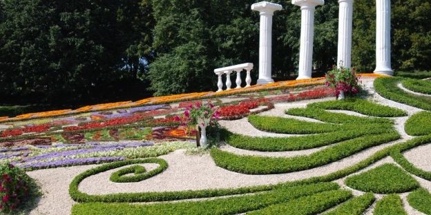
Landscape logo design is quite different from other types of logo designs. Unlike other logos, landscape logos can’t be very bright and appealing, but they should be enough colourful to get noticed. Landscape logos share some common characteristics with Wildlife Logos, Nature logos, mountain logos, scenery logos, and anything that can be characterized as a natural logo.
The demand in the landscaping segment constantly increases by 3% per annum, it is possible to make the best out of this demand through impactful branding, the crucial part of which is logo designing. The landscape logo design has a very first impact on the onlooker. Believe it or not but a creative and insightful logo talks a lot more in its little way. For lawn and landscaping companies, the standard symbols and colors in the logo make the brand recognizable from afar.
Standard Landscaping Logo Symbols and Colours
Even when you want your logo to be unique, innovative, and attractive, there are certain standard shapes and colors that help your target audience recognize the genre of your services at first glimpse. The standard hues for landscaping business logos are blue, green, yellow, orange, and brown while the symbols are trees, garden images, grass, leaves, or mountains. The choice of colors and shapes significantly impacts your logo and your overall branding.
Landscaping Company Logo Design Tips
To get noticed in the tough competitive market of 2023, your logo must be unique and must commute your ideas effortlessly. Some of the best landscaping logo design tips to rule in 2023 are as follows:
- Less is More
“Less is more” is not just an effective Stoic lesson but also great advice while picking a landscape logo. The logos of organizations like Nike, Apple, Adidas, Levi’s, and many others are well-known because they are simple and easy to understand. Creating a simple logo is also a very easy job. You can make a simple logo for your organization by using the name or initials of your organization, using a custom image or brand identity.
Guess what, it is enough to make an impact.
- Use a Readable Font
Even if you provide offline services, people might want to search for you online. Having a website is surely not a big deal in 2023, and that’s the best source for people to know more about your services. The golden rule here is that you can’t hide things you don’t have. Fancy fonts might look great on your PC, but that doesn’t make them look professional or trustworthy. Also, if you want to use your logo on all platforms, make it simple to make it readable.
- Stick to Simple Colors
The right colors can increase brand recognition by 80%. Surprisingly, 95% of the most well-known brands don’t use more than 2 colors in their logos. Although that doesn’t mean that you can’t make your logo colorful, it is advised to not use more than three colors in your logo.
Elements of Landscape Logo Design
Like any other logo, a landscape logo also has some elements which make it suitable for a brand entity. Every landscape logo design must follow the following elements:
- Simple
All great logos are simple because they are easy to remember and understand. Another reason why your logos should be simple is that they are easy to use on all types of platforms. It is easy to resize simple designs without losing their impact.
- Relevant
Every logo design and not just a landscape logo design should relevant to its services. It’s simple if you are not selling shoes, your logo should not look like one. This element should not be overthought and must be applied all the time, every time. Landscaping services could be luxury or regular, but a logo must reflect that effortlessly.
- Memorable
Your logo should be memorable and must not look like anything extraordinary or too common to get neglected. Using unique shapes and colors, you can make your logo memorable for others.
- Timeless
As an organization, you would not appreciate changing your brand logo after every 2-3 years. People recognize your brand through your logo and that’s why you must make it timeless.
Logo Design Ideas For Landscaping Companies
Now that you know the importance of owning a creative logo, let’s slide to some of the unique logo designing ideas straight from the best logo design company.
A Classic WordMark
The classic example of simplicity with class is a wordmark or font-based logo depicting your brand’s name. Such logos are highlighted with standard colors depicting the nature of the brand. The idea is a hit when you have a small and memorable brand name that can single-handedly portray your brand’s purpose. The idea usually doesn’t bode well with larger names.
Memorable Mascot Designs
Holding a creative edge, mascot designs are usually the illustrated characters representing your brand paired with your brand’s initials. This logotype bodes well in communicating your brand’s purpose in a relatable way. Some thoughtful mascot logos create a never-ending impact on the onlookers.
Using Relevant Abstracts
Somehow like mascots, abstract logos are pictorials but made with abstract shapes (in this case landscaping shapes). Because abstracts have minimalist images, it is easier to recognize and relate to the services at the very first glimpse. Abstract logo designs paired with letter marks are the best combination for subtle influence.
Re-Shaping the letters
The image inside the name usually adds a fun element to the generic font logotype that you choose to represent your brand. Letters are elevated to form a relevant shape that goes well with your services.
Versatile Designs
No matter which logotype or styling element you go for, the logo design should be versatile as it goes on different platforms (online/offline). In the run for fancy, some logo designs become a disaster as resizing fades their significance.
Mistakes to Avoid While Designing a Landscape Logo
Hiring an expert logo designer assures that you get the perfect logo for your organization. A mistake in your logo could be an invitation to many problems. Some mistakes that you should avoid while designing a logo are as follows:
- Don’t use generic images or designs
An online logo maker can provide you with many logo designs in a minute, but that’s now how things work. That’s not how brands are made. Consulting a logo design company is what you should do to make the best use of your logo. Professional logo designing services are what help you disappear from the crowd. How would you feel if the brand identity of your organization is being used by schoolchildren for their projects?
- Don’t forget to add one truly memorable feature
There are many landscaping service providers, and most of them have a logo. What makes your logo unique and memorable? Stand alone to stand apart. Add a truly memorable feature to your logo so that people can recognize you. That unique feature could be your font, graphic, or just the overall layout of your logo.
- Don’t choose price over quality
As said, you can find tonnes of free logos online, but that will never make your organization look professional. Consulting a logo design company costs money but is worth it. Spending $100 for getting a professional logo is a good deal if it can make your organization look like a million-dollar organization. The golden rule here is: You don’t need to overspend to look important but never underspend as well.
Logo Designing Is The Series Of Wise Decisions
Logo designing is more about vision than art. You certainly need an appealing logo but more than that it should be minimalist, subtle, versatile, and influential to build your recognition in the market. This is where the best logo design companies with insightful minds and years of expertise are at your rescue.
Image Source: Pendletone/Portfolio/Kevin Deval
Image Source: KickCharge Creative
Image Source: dquarry/HiretheWorld
Image Source: KickCharge Creative
Image Source: DesignCrowd
Image Source: Nathan Dowdy
Image Source: KickCharge Creative
Image Source: sgcanturk/Creative Market
Image Source: Pendletone/Portfolio/Kevin Deval


Amick Rollaerator is so lightweight and easy to use, you can aerate your lawn in minutes!