10 Excellent Logos Depicting Right Stories For Respective Brands

You will get alphabets, hidden meanings, and a plethora of concepts behind various logos but few of them will depict the right story for the respective brands. These are few in number and hence look amazing and greatly intuitive. A good logo should be versatile so that it may support your growing product line. Telling your customers the story and aim of your business is really difficult. Some of the brands have done it beautifully and successfully. A logo design company always strives at creating a story depicting a logo. We have brought a list of the best logos depicting the story for the brands. Find the logos here-
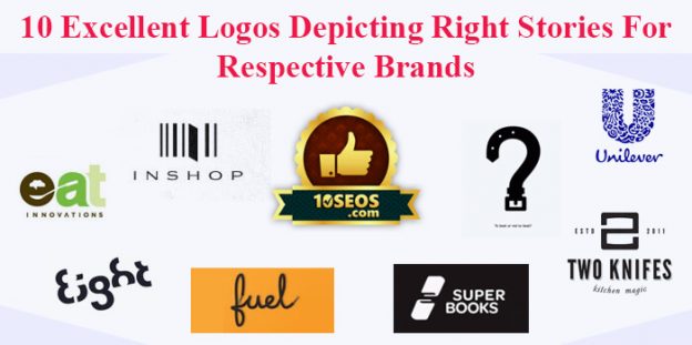
10seos- 10seos is a rating and reviewing company showing a badge in its logo. The logo appreciably depicts the story behind the creation of the brand. Many icons club together to make the logo look elegant and portraying.
Library lovers art auction-It uses books in the form of bristles on a paintbrush. Whether you are interested in arts or reading or writing books, this logo fulfills all your needs. This simple logo uses beautiful shades so that it might not irritate users. The logo is simple as well as shows the real meaning of the name of the brand/event. This is an apt example for brands to depict their stories with the help of logos.
Two knives- The logo beautifully represents two knives on one chop board. At the bottom of the logo, we have ‘kitchen magic’ written in a beautiful font. The two knives on the chopping board make ‘2’. A laterally inverted ‘S’ can be perceived at first glance.
Eight-Eight is beautifully written in words by erasing the little parts of figure 8. This couldn’t be imagined unless we visited the logo. With one simple designs logos, it can convey many ideas. Using symbolism to convey a message or the goal of your ventures is always beneficial.
Fuel: If you want to convey your brand’s position in one word then you should take inspiration from ‘fuel’. The link between the brand name and the product line made the branding simple enough for fuel. The whole world is made up of black lace.
Unilever: The big blue-colored U in the logo of Unilever is made up of 25 small icons. Each icon represents something very important for Unilever. Just like the lock of hair representing Shampoo brands, Unilever introduced everything in the logo from ice cream to tea leaf. Each of the icons in the logo has a rich meaning.
Eat innovations- Eat innovations makes fantastic use of negative space in its logo. The logo shows food and spoon with little green shade for being environmentally friendly. Logos with negative space play creative and innovative. It is really tough to use the negative space in a logo as you have to include a hidden shape in between the words. With the emergence of new innovations, more and more artists are working towards making logos use negative space. If you are putting baby steps into the market then seek the services of a logo design company that can offer such a logo.
To beat or not to beat? The ‘To beat or not to beat’ logo uses a belt to give the logo the shape of a question mark. The relation between the question mark and the belt has been made for a humorous view of the relationship between parent and their children.
Super books: Fantastic use of negative space has been made by Super books. The logo shows two books with space between them in the shape of S. This is something creative and very innovative. The two books in the logo are kept in reversed direction.
In a shop: The brand beautifully represents an opening door in the barcode. Creativity is often about simplicity. In the shop is a great example of being innovative and creative at the same time. The witty logo represents an opening door for the eternal services by the giant.
Talking about the negative and positive spaces, sometimes the brands make such a beautiful and witty use that people cannot take notice of actual words written. The shapes are so included in the logos that the story behind the brands comes out clearly. If we take the example of the popular courier company FEDEX, we can see an arrow heading forwards. The space between the letters E and X has been used to give a home to an arrow heading forwards. Among designers, the FedEx logo is a legendary piece of art. Up till now, the logo has won nearly 40 design awards. This is the best example of using negative space. The masterpiece was created years ago but it still holds the top position.
Negative space logos are the ones that make the spines of great designers tingle. It is the same thing as the white space left after the logo has been created. It is really important to provide emphasis and logic in that space. At the first glance, we cannot notice the use of space but if we closely look at the design we can understand the usage of both positive and negative spaces in the logos. It is all about hiding a shape associated with your business in the logo and you won the race. It is not always necessary that you make use of both the spaces but nothing can be better if the logo can depict what you serve.
The logo depicting your story can benefit your business in many ways. The logos of such kind show that there is a depth in your services and brand name which naturally intrigues. People who find out the hidden shape inside the logo of your brand feel associated with the name. Once the hidden shape has been noticed, people would prefer to look at it for a longer time. The same will somewhere increase engagement on your web pages. The icons can even be used as favicons. Discuss the above-mentioned concepts with your designers to fire the imagination.


Logo plays the key role in our business, so it must resemble the business very well. Thanks for information.
Wow! Just came across some very creative and meaningful logos. Very nice. Graphic designers should be a creative thinker beside his designing skill.
Great post. Thanks for sharing this information with us.
I like your article and it really gives an outstanding idea that is very helpful for all the people on the web.
I would like to share this blog with you .please let me know what you think
Simplicity is key when creating a logo, and letter marks are about as simple as it gets. They’re similar to wordmarks in that they’re comprised of text, but highlight the company’s initials rather than their full name. logos perfectly encapsulates the associated brand, and yet, each is an entirely different type of logo design.
logo is the most and main roll play in business, its grow a business because anyone see the logo first your blog is very nice thank you for giving me good information
it is a excelant blog.
Human Resources in Japan | TMT Aba
Great post, I appreciate you and I would like to read your next post. Thanks for sharing this useful information