Apple Logo – Learn About the History, Branding and Logo Evolution
Do you want to know about Apple’s logo design? What is the history of the Apple logo? How did the Apple logo get famous? What are some of the facts about Apple logo design? We have explained everything about the world-famous company Apple’s logo. The information will help you a lot and provide you with the best ideas to have a uniqueness in your business logo design. Read here to know all the things about logo designing for your company. Here you will be getting the treasure to explore world-famous logo design.
Apple became the first-ever trillion-dollar company in the world. Apple is the company that has a logo of fruit but they still managed to redesign every aspect of our lives through their cunning technology.
Apple is well established and known for its sleek designs and impenetrable security is surely one of the greatest gifts to this generation. That’s why they love to spend so much just to showcase that creative logo on their devices.
But have you wondered why a technology company has its name behind a famous fruit and so does its logo? You and I both know the importance of the logo and the part it plays in today’s competitive market. But why are an APPLE and a BITE taken from the right side?
There is much more to the power behind this logo and Apple’s emotional and effective branding methods. According to the experts from the top logo design company Apple’s logo is the perfect definition of simplistic, sleek, intelligent, and intriguing. Unarguably it is one of the most powerful designs in existence at the moment. But apart from the reason their name is Apple so their logo also has to be Apple, there is more to this logo. So, let us plunge into the hows and whys to understand it all.
Let us start with a quote from David Airey, ‘A logo doesn’t need to say what a company does. Restaurant logos don’t need to show food, dentist logos don’t need to show teeth, and furniture store logos don’t need to show furniture. Just because it’s relevant, doesn’t mean you can’t do better. The Mercedes logo isn’t a car, the Virgin Atlantic logo isn’t an Airplane and the Apple logo isn’t a computer, etc.’
From Apple Computer Co. to Apple
As you all know that Apple was started in 1976 by three visionaries Steve Jobs, Steve Wozniak, and Ronald Wayne. But very few people know why it was named Apple.
So, once Steve Jobs visited an Apple farm during one of his ‘fruitarian diet’ escapades. When they were working on the idea to sell personal computers, all three of them wanted the name to be fun, spirited, and not intimidating. Well, we do not know about it earlier but today’s Apple is surely intimidating as hell.
Jokes apart, they decided to name the company Apple Computer, Co. when they started the company in Job’s parent’s home in Los Altos, California. Within a year, Apple computer Co. became Apple Computer Inc. in the winter of 1977. There was a significant shift in the momentum and companies and people started to purchase Apple’s computers and they found a huge revenue growth.
The next year, in 1980 Apple went public and simplified its company name as its financial success is right next to its footsteps. Now forty years later, Apple is a multinational corporation and still stands behind its initial primary concepts and that’s what set them apart from the other business. Now coming to the Apple logo over the years.
Despite carrying the name Apple, the company’s first logo did not have the physical shape of an Apple.
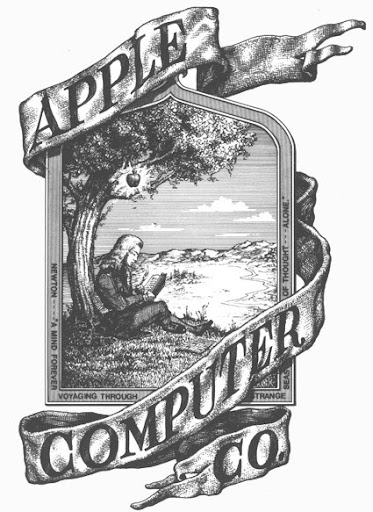
Apple’s First Logo in 1976 – Designed by Ronald Wayne
In its initial stage, Apple’s all three founders wanted to represent the law of gravity to symbolize their company. Ronald Wayne designed Issac Newton’s image which went on to become their first logo. It was a depiction of this event, with Newton sitting under an Apple tree. Not only this, the logo included a romantic English poem, ‘Newton… a mind forever voyaging through strange seas of thought.’ The poem was written on the frame of the logo. However, the Newton logo didn’t last very long.
Steve Jobs, when working as the head of design at Apple he thought of exploring something new for the logo, something that seems different to the audience. He was right in believing the original was too old-fashioned and considered difficult to use on their products and marketing platforms. He planned to fuse the Apple name and logo into one. So, Jobs decided to hire the famous graphic designer Rob Janoff.
Rob Janoff is the one who creates the now classic and world-renowned logo of the bitten apple. The bite seen in the Apple logo was originally implemented so people would not confuse an apple for a cherry tomato. But Janoff’s team of logo designers believed to have another idea behind the byte. The ingenious team answers that ‘bytes’ were the foundation of computing. The plan on words byte was an incredibly relevant reference for the tech company and the happy coincidence of the design has only contributed to its memorability. Jobs decided to quickly throw away the old Newton logo, and Apple’s logo was fully established and started using by the company everywhere.

The Evolution of the Apple Logo
When Janoff brought his designs to the first meeting then his focus was on the two versions. One with the bite and one without it. Both logos were seen with stripes, a solid color, and a metallic apple. The colorful version which was dubbed the “rainbow apple” was chosen along with the sans-serif font accompanying the Apple graphic.
The logo designer from the Rob Janoff team states there was no reason behind the placement of the colors themselves. But Steve Jobs made sure the leaf at the top must be green. The point was lots of different fruits have stems and are sort of round with a leaf dangling off of it. According to Jobs, “Just like Apple shape didn’t have to do with the computers, it’s just there to get the people’s attention and tell them the Apple computer is not just some piece of hard-edged metal that has no place in people’s homes and your kid wouldn’t want to be near”.
Then Apple’s design with multi-colored stripes was promptly started to get printed for advertisements, software labels on cassette tapes and signage hardware emblems, etc. It was long before the colored Apple logo debuted on the Apple II computer in April of 1977 at the West Coast Computer Fair.
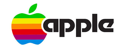
For the next 20 years, Apple got a lot of love for this logo as they kept on achieving immediate success year after year.
After a while, the revolutionary design firm from Regis Mckenna which has already helped companies like Compaq and Intel was hired by Apple for a full business and marketing plan for the company. They made Apple realize that colors are complicated to print and also printing the colorful Apple logo was a huge expense.
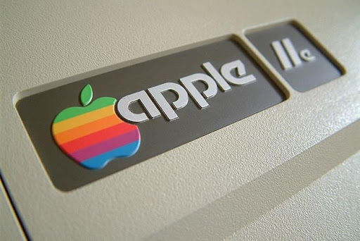
Apple II Computer with the multi-colored Apple logo
The multi-colored Apple logo had been in use for 22 years before it was axed by Steve Jobs less than a year after his return to Apple in 1997. Everyone saw the company typeface replaced by a custom Garamond that eliminated the wordmark and introduced heavy emotional branding and the rise of their graphic iconography. But still, Apple’s logo is intact since its inception. The whole world recognizes the logo as the company does not even have to print its name alongside the logo. The logo itself tells it all and that was always the idea behind Steve’s vision for his company.
Moreover, the former Apple executive Jean Louis Gassee called the logo the perfect symbol of lust knowledge. They want this logo to symbolize the use of their computers to obtain knowledge and ideally, enlighten the human race.
Monochrome Apple Logo – 1998 to Present
This change came when Steve Jobs came back to Apple. However, this change was not only for the reason that Steve Jobs is looking to change things. Because when he returned Apple was bleeding money from everywhere and Jobs realized that the Apple logo could be used to their advantage.
The logo traded in its colorful display for muted tones, becoming translucent and monochrome. When Apple released its first-ever iMac, the Bondi Blue, the logo needed to be changed, and its rainbow color needed to be disregarded. This change in the logo was also Apple’s first major change or we can say update in 22 years.
Apple’s Metallic Logo
The new logo took on a metallic look with embossing, which was applied to most of their products. And their ‘Glass’ themed logo was the next evolution for the logo. In today’s date, Apple uses a more modernized flat and minimal logo. The logo comes mainly in 3 colors: silver, white and black.
This was implemented across all operating systems and printed materials alongside the release of the Apple watch. One thing that every top logo designer company says is that consistency is a major aspect of creating a lasting logo, and that explains why the base of Apple’s logo design has been successful for decades. A few years back, Apple applied for a brand new trademark logo for a multi-colored icon to sell merchandise featuring the fresh logo.

Apple’s New Modern Design
The Popularity of Apple’s Logo
Whenever it comes to mystery then it drives curiosity and that’s what is driving this world ahead. The lesser people know about an object, the more they lust to find out more about the idea. And that’s what all Apple was about. From its initial stages, Apple is used to being puzzled by the customers and that’s what attracted more consumers to them.
Today, Apple is the biggest and strongest brand in the world. And as already mentioned Apple is also the only company in the world to have achieved a market cap of $1.2 trillion. Apart from its amazing and quality products, Apple’s powerful logo, innovation, and marketing drive are all the reasons behind it.
Apple’s marketing methods are very well-known around the whole world. 1984, the Apple Super Bowls campaign is a prime example of it. Many top marketers still regard it as the most successful Super Bowl campaign which shocked the tech industry that it can also happen. Apple showed that they are in the minds of people as a tech giant.
Another major marketing drive that made Apple popular was its “Think Different Campaign” in 1997. It won many hearts.
Apple’s Think Different Campaign
Theories Around Apple’s Logo
There are three popular theories about Apple’s logo. So we thought of outlining all these three popular theories and we ask you to choose your favorite from them.
1. First Theory – First theory suggests that Apple’s logo has been linked to the Garden of Eden. The same garden where our beloved Eve took a bite from a forbidden fruit picked from the Tree of Knowledge. And if you can’t remember then it was the same plant that granted her the wisdom of the gods as she gave in to temptation.
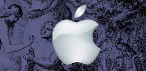
Apple and the Garden of Eden
2. Second Theory – Second theory was given by a famous graphic designer known as Thiago Barcelos. He applied the Fibonacci sequence or golden ratio to Janoff’s original Apple logo. Although the original designs did not refer to these calculations, this logo’s underlying structure may subconsciously explain why Apple’s brand has endured the test of time in a rapidly moving industry.

Apple and the Golden Ratio
3. Third Theory – This is probably the most interesting theory of all time. Another famous author of Zeroes and Ones: Digital Women and the New Technoculture, Sadie Plant, wondered about Apple’s logo for the longest time. He believed that the Apple logo was a homage to Alan Turing. For those who do not know that Alan Turing was the father of the modern computer and revolutionized overlapping fields of math, science, and technology through his publication “On Computable Number ”. Everyone knew he was unrecognized for his work as his research into artificial intelligence helped unlock German wartime codes. Coming back to the theory, conspiracy philosophers believed the Apple founders considered all of this while looking for a logo. According to these people, these people wanted to honor Turing for his contribution to their field through the bitten Apple.
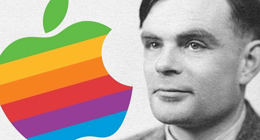
The Apple logo and Alan Turing
Endnotes
The Apple logo is the perfect definition of simple elegance, easily interpreted and modern at the same time. It is one of the reasons for Apple’s success and that’s why Apple never has to put information about the company name in the logo. Rob Janoff was able to give the exact identity that the founders of Apple want. We hope you like this detailed article on Apple logo evolution. It may be started with fruit but it started the revolution of being the logo of one of the biggest tech companies ever.
You are a unique business and you need a unique identity world from a famous company like Apple. We have the expertise that helps you with the best logo design for your company.
VerveBranding can be your one-stop solution for branding and designing because we have decades of market experience and a team of experts who, over the years, have worked on many major and minor projects for all types of industries. We provide designing and branding services at the most affordable price. For services related to mobile app development or web development and online marketing services, check out our subsidiaries, VerveLogic and VerveOnlineMarketing.


