9 Best Logo Design Tips to Take Your Brand to the Next Level

As a beginner or even an experienced logo designer, you always need a refresh to know the latest take on the industry and also current trends. This is why we have come to your rescue and told you what are the best logo design tips that can help you design a logo that is not only, unique but also creative and professional.
A logo design is very important for any business whether it is for an organization or a personal brand. You need a logo for many purposes like printing a business card, for a website, for products, and many more. A logo represents your identity, your vision, your idealogy, your personality, your field, etc. So, it is essential to choose your logo design company wisely.
If you are planning to do it by yourself, then do not worry we got you covered. We have some amazing tips and tricks for logo designing in 2023. But before digging deeper into tips you must know some essentials that your logo should have.
They are listed below-
- Timeless
- Eye-catching
- Should work for you large or small
- Should go with the brand vibe
- Memorable
What Is a Brand Vibe and How You Will Know What is Yours?
If you are wondering what is a brand vibe then you should know it is a perception that you want your audience to have about your brand. For example, you expect trust, quality, and variety from a fashion band but expect calmness, peace, and gentle vibes. This is what your logo should reflect on the audience.
Once you find the vibe of your brand then it gets a little easier to design a logo. In the same way, knowing what you want from a shop then it gets easier to pick and get free fast.
You get the point right?
Now, the thing you need to do for knowing your brand vibe is to jot down four to five words that come to your mind. These words are the perception that you want to give your customers about the brand.
The next step after knowing your vibe is to try out two or three options of logo designs and test how each of them makes you feel. Then, you can decide according which suits you the best. With many years of experience, VerveBranding is a professional logo design company that can help you craft a beautiful, yet professional logo for your brand to outshine. Now, you can scroll down to the logo design tips.
Top 9 Points to Remember for Logo Design
A picture speaks a thousand words
As we know a logo is the visual representation of a brand. So if you do not make it relevant and memorable then nobody is going to remember it in this era of competition. So, you need to focus on keeping it simple. You should use simple icons to showcase who you are as a brand. Exactly, the point is why explain with words when you can just show?
Remember the brand vibe we have just discussed it plates an important role to make your visualization better. If we take the example of an airline company logo then if it has clouds, sky, and sun in it we will automatically remember a sunny vacation at a peaceful place. Here, the motive of the logo maker is served.
Visual puns are always logo designers’ best friends. If we take an example of an ice cream brand that has a bite sign in the logo then it simply represents a food company and it is very easy to draw. You can just add two overlapping circles with the same colors as the background. It is also possible that you might have different types of food businesses so you can still use the visual pun of having a bite sign on your logo and changing the idealogy of food.
Empty spaces are necessary
To make your logo more clear and attractive you should consider giving empty spaces so that the design can be highlighted. Once Coco channel said something about being subtle, you just need to look in the mirror before you leave your home look in the mirror, and take off one thing.
The same you need to do with your logo design. By doing this you can keep your design clean and make it visible to people from a distance also. Savant Yoga is the perfect example of giving spaces in the logo design. This is because the space in the logo is invoking calmness and a peaceful feeling.
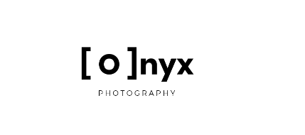
On the other hand, if you take the example of the photography brand Onyx, then it took the idea of minimalistic design to another level. It proved you do not need several colors to make a logo. The logo design has created the camera with two square brackets and the letter ‘O’ of Onyx with proper spacing and visible effects.

Use of Shapes
Shapes are an excellent way to send a direct message and sharpen the design. You can easily stand out with the help of shapes. If we take a law firm logo then keeping the letters or firm name in a box represents trust and professionalism. You can use them for cross-platform branding. They are good for websites so as for letterheads, they are good for merchandise so for pens.
Shapes can be a great way to define many attributes of a logo. If we take the example of FX Technology CO. then putting the design in a circle is creating a more trustworthy and professional vibe for it. The design can be easily moderated according to your business. Like if you have a wine business then this laptop can be replaced with a bucket with flowers and a bottle of wine with a different and vibing background color.
Experiment with situ
Imagine you own a coffee shop and want a logo that can attract customers and tell your story. Then you try different fonts but situ might do the magic for you. Imagine how amazing it world looks on a coffee mug.
This is exactly our point you need to think broader while designing a logo. For example, you need to think what is possible usage of that logo. It can be used on merchandise, for branding products, for websites, or for many other uses. Try and think about how your logo design is going to look for all your purposes then proceed.
You need to analyze your goals for creating a logo and also how you are going to promote this logo. If you are going to do a lot of networking then you need a logo that looks good on business cards. This is only one example you can think of something that works for you.
Color is a key to successful design
Monochromatic color does not always mean black and white. So, you need to first think about your vibe and then select a color accordingly. No doubt having a black-and-white option is good but you need to test a different color and the shades according to your brand identity and vibe. If you want your audience to feel zen and peaceful then the black and white combination can be a little harsh this is why go for pastel and bright color pallets.
Generally, cold colors should be the voice for a soothing vibe, and for an enthusiastic vibe, you need warm colors.
Giving your logo a color pop can be very visually appealing and the logo of Amazon is the biggest example of this.
Be literal with your design
Sometimes the easiest solution is in the question and we complicate the answer. You just need to be literal sometimes, this is all you need for the best logo design. The biggest example of this thing is Apple which has an apple as a logo. And nobody can deny it, it is iconic.
Brewery logos are notorious because they are literal but accept it or not it always works for them. The biggest example of this is the Cigar City Brewing logo.
One more important thing about words in the logo is to be authoritative and make your logo trademarked. This is because if you do not do it some words or designs can depict the same in a regional language and your competitors can easily take that if you have not registered it. The result is only a lot of legal fees and years of dispute. So, you need to make sure that you make your logo registered under your brand name.
The liter logos of FedEx and Gold Spoon are the biggest examples where you can see literal is not boring because they have beautifully designed their logos.
Font of Logo
You need to be very careful about picking a font for your logo. You need to ask yourself if you were a customer would your trust this company? If yes, then good, otherwise work harder on the design. This is why Sherif and sharp fonts are always a rescue in such situations so if you want your audience to take your company seriously then you need to make your logo look that professional, and appealing. It should not be cartoonish still be vibrant and enthusiastic and a correct font can give you, so pick wisely.
Do not try to reinvent the wheel
Sometimes very simple elements work with your idea and vibe. If you have a bakery then only wheat on the logo design can work for you simply. Just go for it. This is why you need to be more thoughtful but not picky because simplicity is the place real magic happens.
Slow take on innovation
Having change and adopting new trends will always be part of the industry. But as a brand, you need to understand that initially what you launched as a logo design has already made a connection with your users. This may hurt the sentiment of your customers if you drastically change the entire logo. So, it is advised to take a slow take on innovating your logo design. So, your customers can feel the old touch and stay connected with your brand.
Summing Up
These were some crucial tips for a logo design that can gear up your business and take it to the next level. But trusting a company that can help you get through this journey especially when you are new in the industry is a wise decision. They can bring their years of experience and expertise to the table with a team of professional logo designers.
VerveBranding can be your one-stop solution for branding and designing because we have market experience and a team of experts who, over the years, have worked on many major and minor projects for all types of industries. We provide designing and branding services at the most affordable price.
For services related to mobile app development or web development and online marketing services, check out our subsidiaries, VerveLogic and VerveOnlineMarketing.


Thanks for this marvelous post, I am glad I discovered this website on yahoo.
I’m not that much of a internet reader to be honest but your blogs really nice, keep it up! I’ll go ahead and bookmark your website to come back later. Cheers
Loving the info on this web site, you have done great job on the articles.
I was just seeking this information for some time. After 6 hours of continuous Googleing, finally I got it in your site. I wonder what is the lack of Google strategy that don’t rank this kind of informative websites in top of the list. Usually the top web sites are full of garbage.