How Color Make us Feel – A Report on Color and Emotions

When it comes to colors then they are many times interlinked with the emotions of the person. And yes it is true, colors do play a role in our lives and are different in every person’s mind. As there are different types of colors, each of them can raise different kinds of feelings and emotions. It all focuses on how the psychological effects of color are being used.
The colors can make us feel happy, or sad, or evoke other feelings like hunger or relaxation. All these reactions are rooted in psychological effects, biological conditioning, and cultural imprinting. So, this makes a comprehensive understanding of the effects of colors on the person very crucial. Along with the psychology of colors, we must also have a closer look at the fundamentals of color theory and the meaning of colors for a better and clear understanding of colors and their emotions over us. It makes things easy for the men who are looking to create a logo for their business and the logo designers who use different colors to create effective logos for businesses.
As much as colors are important in today’s lives, we must also have detailed information on 7 different types of logos that you can create so your business can have a positive impact in front of your existing and potential customers.
Colors and Emotions
Have you ever wondered why colors and emotions deeply affect the psychology of a person? If not then it all depends largely on the color’s brightness, tint, shade, and tone. As every brain works differently, all these shades affect differently on every person. All these mentioned characteristics define whether these colors are cool or warm-toned. To create graphic design and logo design, it is really important to understand the colors and emotions. To understand in more detail let us have a look at some of the effects colors can have on how we feel.
Cool Colors – Cool colors category consists of green, blue and purple and often promotes calmness and smoothness but can also be used to promote sadness. If your business is planning or revolves around health, security, or beauty then incorporating these colors in logo design is a very good idea. The best part of using purple color is that it also helps in sparking creativity as it is a result of two great colors: blue and red.
Warm Colors – Warm colors category consists of red, orange, and yellow. These three colors also sit next to each other on the color wheel and are used to boost the sentiments like happiness, optimism, and energy. The use of warm colors is a perfect choice in logo design and graphic design as these have an attention-grabbing effect and evoke the effect that makes you take the action.
Happy Colors – Happy colors include bright colors like yellow, orange, red, pink, peach, or even lilac. All these colors have an uplifting effect on your mood which makes them the perfect colors for the logo and graphic design of your website and app. The brighter the color, the more happy and optimistic you feel.
Sad Colors – Dark and muted colors are often known as sad colors. For instance, grey represents the perfect example of a sad color, and blue, green, and other neutral colors are quintessential to dark and muted colors. All these colors can have similar effects on feelings and emotions, depending on how they’re used.
Energizing Colors – Bright and neon colors can have a strong effect on our minds in less time. If you are looking to incorporate energy into your design then we suggest chatting with your logo design company in India to use energized colors like bright yellow, bright red, and neon green to make it more alert. These colors usually grab everyone’s attention as they help you stand out from the rest. The colors like magenta, royal blue, emerald green, etc fall in the category of energizing colors as they can make you feel refreshed and energized.
Calming Colors – Everyday colors like light blue and light green can make you feel calm and everyone in the surroundings. The colors like lilac, mint, white, and beige have a calming and soothing effect. The trick is, the fewer colors you combine, and the more simple design is, the more calming it will feel.
So. much of choosing the right colors in your logo and graphic design let us not forget the best logo fonts to use in a logo. The right combination of color and logo fonts is the key to winning the marketplace with your logo.
How Colors Make you Feel
Red – Red is one of the most dynamic colors which makes the person feel passionate and energized. Red is also known to help in triggering opposing emotions and is usually connected with passion and love along with danger or anger. Red is the warmest color and can also make the person excited when used purposely. If you are looking to bring your logo to the attention then using red is a perfect choice. As a logo designer, you must also consider the level of using red as it can be overwhelming.
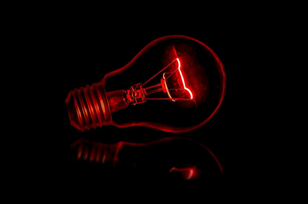
Image by Terry Vlisdis | via Unsplash
It has become more and more important for businesses to describe their business more elaborately in less time. A logo helps in an easy explanation of your business. With the best logo design company, you can have a perfect logo that represents your business on an international and national level. To make things easier for you, we brought the top tips to plan creative logo designing ideas that will help while designing your logo
Orange – Orange is used to enhance the energetic style and happiness along with making you feel energized and passionate about something. Just like red it also draws the attention of the people. The best part of the orange is that it doesn’t overpower the other colors in the design and gives out a balanced image. It can be used to show energy but at the same time, it is inviting and friendly. As per the latest research, orange is a right for a call to action to buy or subscribe to a product.
“Have a look at the aesthetic feeling the orange is offering to the upper white van and a green-gray background with black outlines. Makes you feel like going for a ride in the same bus right away.”

Image by Thomas Millot | via Unsplash
As mentioned, a logo defines a business’s individuality and helps in establishing the business in front of the user as the logo is the first thing that people see. So, it’s crucial to have a unique and distinct logo for your organization. But it is also important for you to know how much it costs to get a quality logo that easily adds value to your business. So to make it simpler for you we have a blog dedicated to logo design costs so you can understand the ins and outs of logo design company and their cost of developing the logo.
Yellow – Yellow is another energizing color in the list which makes us feel happy and spontaneous at the same time. It is usually connected with laughter and hope. Using various accents of yellow, you can create a cheerful logo design as the best logo design company in India can make your users feel cheerful and optimistic at the same time. However, the use of yellow must be done in the right way as too much brightness can irritate. Moreover, you can use yellow in your design to grab attention in an energetic and comforting way.
The below image perfectly shows the use of yellow with a black aesthetic and grabs the attention of the user.

Image by Blake Hunter | via Unsplash
Green – Green makes you feel optimistic and refreshed at the same time as it symbolizes many things like health, wealth, and even new beginnings. The best part of using green in the graphic design and logo design is that it is easy on the eyes calming and relaxing. It is perfect for companies that want to show growth, and security and inspire new possibilities.
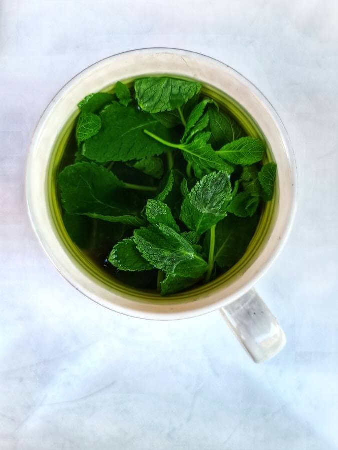
Image by Martin Widenka | via – Unsplash
The above image shows the blend of white and green to create an aesthetic design to feel relaxed and calm.
Blue – Blue is often used to raise sentiments of calmness and spirituality and a sense of trust. In research, it was proved that on seeing the color blue our brain releases chemicals that are calming and that is why it is one of the most favored colors in the world. Dark blue is also perfect for corporate designs as it helps in providing a professional feel. On the other hand, light blue gives a more relaxing and friendly feel. Two great examples are social sites like Facebook and Twitter which use two different shades of blue in their logo which represents your business.
Image by Zane Lee | via – Unsplash
Purple: Purple color helps in showing your creativity as it is associated with many aspects like royalty, mystery, creativity, and also wealth. The best part of using Purple is that its lighter shade can be used for a calm and soothing view. As a logo designer, you can easily incorporate purple to create a luxurious and affluent logo and other lighter shades to show mystery and romance.
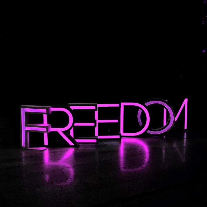
Image by Kristina V | via – Unsplash
Purple projection mapping on a Freedom Logo. It offers an aesthetic view in the dark background.
Pink – Pink is the most romantic color out there in the world. It also represents femininity, sensitivity along tenderness. It is also sweet, cute, and charming to use in your logo. The Best logo design company can use various shades of pink to come up with one of the most liked logos to represent your business.
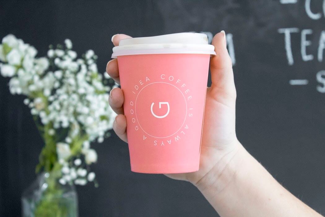
Image by Social Cut | via – Unsplash
Coffee is always a good idea. Written using Proxima Nova font on a pink background gives this logo an instant attraction and the best logo at the same time.
You must have heard it many times. “The First Impression is the Last Impression!.” Well, the same is followed for your business. And that is why it is suggested to have a well-designed logo that can make a huge difference in your business. An attractive and effective logo can easily communicate with your target audience along with conveying your message to them. However, it can be difficult to approach a logo design company without prior information. Do not worry, to make it easier for you we have created a blog if you are “Planning to Approach a Logo Design Company”.
Brown – Brown is known as a solid, earthy color, and also gives a sense of strength, reliability, warmth, comfort, and security. The use of brown in your graphic design and logo design makes you feel down to earth. If you are planning to showcase your business as old-fashioned or established a long time ago then brown is the color you must depend on. It also offers a sense of support and stability which makes it great to use by logo designers.
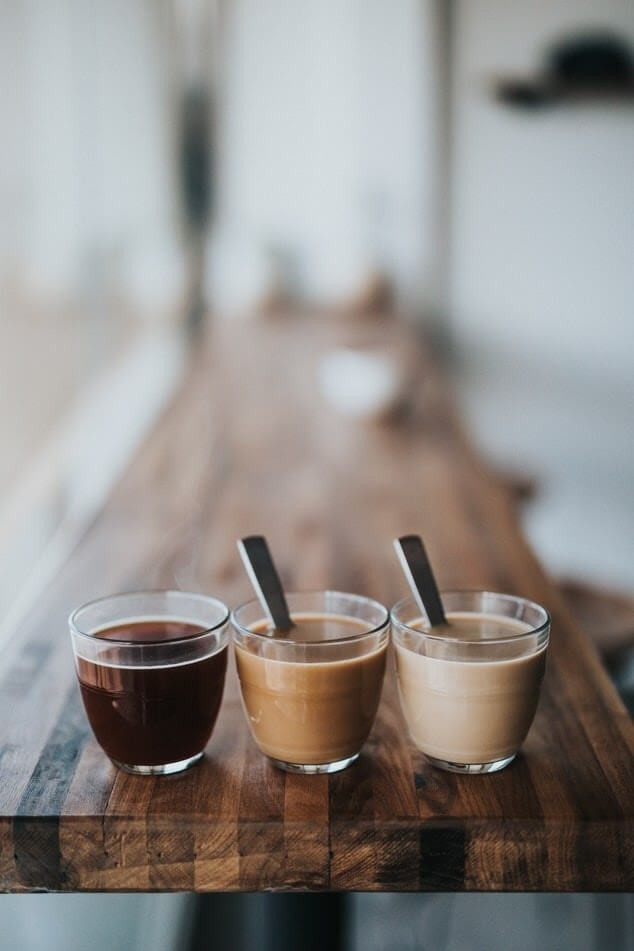
Image by Nathan Dumlao | via – Unsplash
The different shades of brown are elegantly shown through coffee on a pleasing brown table which itself offers different shades of brown.
Black – Black is usually associated with power, fear, strength, authority, and elegance which makes it perfect to use in your logo. I have read it somewhere “The black color is the absence of color”, I guess which makes it perfect to add your creativity and come up with an amazing logo just like Nike and Adidas. Along with all the above characteristics, it also offers luxury, professionalism, neutrality, and simplicity.

Image by Molly BlackBird | via – Unsplash
Darkness evokes the possibility to add something great to everything it touches.
White – White stands for minimalism along with simplicity. If you use a lot of white color in your graphic design or logo design you will get a minimalist aesthetic with a simple and fresh look. White also refers to, pureness and innocence behind it. For instance, if you are planning to sell daily products, bridal gowns, baby clothing, or related products then a white logo will perfectly represent your business.
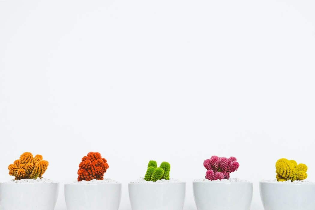
Image by Scott Webb | via – Unsplash
White color tends to clear visual clutter, and offer an illusion of space, along with making us feel good.
Grey – Grey is the color of matureness, seriousness, professionalism, and responsible color. Its positive connotations include formality and dependability. Being a neutral color somewhere between black and white, it is often most used for the type within logos. It is neutral and works well with most other colors.
Creating a logo is not an easy task. Even for an experienced person, it takes a lot of skills to come up with a great idea for a logo that will represent your business. So, you need a pivotal solution to get the perfect logo for you and your business and this guide will lead to the same. To make it simpler for you we have developed a detailed blog that will tell you “How to Design a Logo – The Ultimate Guide“. With these 12 steps, you can achieve excellence with your logo design & establishment in your market.
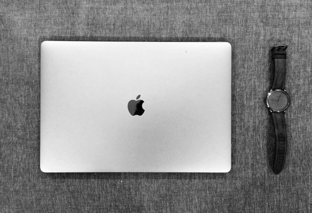
Image by Immanuel Jebaraj | via – Unsplash
I believe very strongly that when it comes to desire, when it comes to attraction, that things are never black and white, things are very much shades of grey – Brian Molko
Aforesaid that colors can be subjective, depending on person to person. There is a high possibility that it will make one person cheerful and another person irritated. It also depends on the surroundings and the areas of a person’s life. No matter which color a person loves, they are emotions, a way to share our insights with others in a much better way. All these points make colors very important for the best logo design company to express what your business resembles. You can choose colors accordingly to find out which color will perfectly fit your logo design or even the graphic design.
Conclusion
The colors we use for a particular purpose- all have a meaning. Suppose you are looking for primary or secondary colors for your company branding. You need to finalize which color will fit your business theme. Because the colors in your company logo design including your company logo- are your identity. You can not use any of the colors for your business. You have to stick to colors that you want your business customers to remember as your business identity. The color’s meaning explained above helps you understand. What colors must you be choosing for your business branding? How your business customers feel about you as studied by psychologists.
You must be choosing the right colors for your business branding to build your business identity. If you need professional services for logo designing or branding- our experts in the brand building can help you with their expertise. Connect with us right away to have the best services in logo design and branding.
VerveBranding can be your one-stop solution for branding and designing because we have market experience and a team of experts who, over the years, have worked on many major and minor projects for all types of industries. We provide designing and branding services at the most affordable price.
For services related to mobile app development or web development and online marketing services, check out our subsidiaries, VerveLogic and VerveOnlineMarketing.



So beautifully you guys have talked about colors. Loved it.
Sounds interesting, thank you very much for your comments.