How to Design a Business Card – The Ultimate Guide
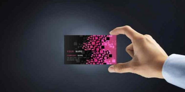
Do you want to design a business card? How to design a logo for a visiting card? What should be the size of my logo for a business visiting card? What should be the size of the card? Can a graphic designer design my visiting card and logo also? In this article, we have discussed visiting card designing. The guide will help you with the best design services for you. Reading this blog you will be able to have the best info to design business cards and logos.
A business card is the most powerful tool when it comes to offline marketing. No matter which industry you belong to, a business card, donning your company’s logo on the top will contribute to your brand’s recognition and its ultimate goodwill.
As it is said by Paul Rand (the American art director), a logo’s primary goal is to identify what the company is and what it does. If done right, this professional pocket-sized card with the best logo design of the company will help you with advertising your brand, create awareness and help your clients anticipate the call to action.
To get on the right foot, here is what an impressive business card contains
-> Your brand logo and name (Some brands are known by their logos more than their actual names)
-> A one-liner depicting the vision of your brand.
-> Your name, designation, and contact information
-> Just the right color orientation appealing to the eyes.
-> Feasible fonts– Easy to read at a glimpse.
-> A call-to-action (call at, ping me on, message, reach out to us at, etc.)
Owning a business card is a crucial asset for any business regardless of its size, nature, or scale (MSMEs, MNCs, or large enterprises). Moreover, it is the most affordable way for gaining publicity and sales for your company.
The article depicts everything you need to know about the amazing marketing tool – the business card designs. It is for you to hold an edge in knowledge when you approach the designers for your tasks.
Before you start to design a business card design….
Brand Logo Designing is Crucial
The Logo (usually placed at the top of the business card) is the visual identity of your brand. The logo captures the eyes at the first glimpse and it often creates an impact on the viewer which remains even if the name is forgotten. Make sure your logo is able to make a difference.
The professional logo design company understands your mind and assures that your logo makes a difference by coming up with some ruthlessly innovative design ideas for your best bet. In the end, it is the creativity and the design that matters, here are some tips to come up with the best logo design ideas.
A Definite Color Palette
After the logo, it is the color scheme that arrests the eyes of the people, moreover, the adroit color choice will let people perceive good about your brand. On the contrary, a wrong pallet might influence your business card on a professional level.
Heads-up – avoid extravagant pallets and make sure the text on your business card is visible at the first glimpse.
Know what You Want to Communicate
Unfortunately, you are allotted a small canvas to fill in with the important information. Contact information is a must, as multiple channels for communication, call-to-action, your brand’s vision, and the branding of your business. Before you go with the design make sure what you want to communicate through your business card.
For contact information, go with standard symbols instead of words to showcase the information. Examples are for call (a receiver), message (envelope), brand symbols for Instagram, Twitter, and Facebook, and so on.
8 Crucial Steps To Design a Business Card
People often underestimate the power of this pocket-sized asset, a well-designed business card can be your best marketing tool that will create an image even before the person comes to you for a purchase. Especially for B2B buyers, a professional business card holds the power to create an unceasing impression of the dealing company.
Under some circumstances, a business card creates the first impression of the brand (based on which the buyer perceives your brand) and it needs to be taken care of from the start.
Here is the roadmap to Desing a Business Card
We have added all the points that you can use to have the best services to design a business card. Implement all the points to have the best design services. When you use all these important points added below. You will be able to come up with awesome designing services you need to have for your company. So, let us see what are some of the top things that you need to implement for your company visiting card designing.
1. Go With the Best Shape
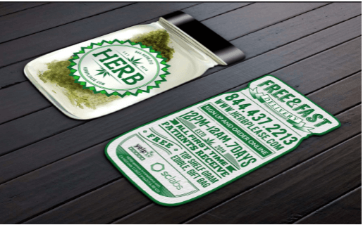
Gone are the days when the rectangle was the shape for all business cards. The times have changed and so has the imagination of business card designers. If we are looking at business cards as a marketing tool, it has to create an impact.
Die-cutting is the printing technique that gives you the flexibility to explore alternative shapes and still the cards will print in bulk. Making optimum use of the utility, you can put your best bets on the shape of the cards and create a difference. You can be creative with business card design by copying the shape of your signature product or any other out-of-the-box design that’s unique and captive.
On the contrary, if you want to keep it simple go with the friendlier business cards just by flattening the edges of the cards (this will establish your business card as a standard card).
The innovative business card helps you create an outstanding first impression and gives the idea of your business with just a look at your card. Now that you have the flexibility of die-cutting make sure you hold a level of professionalism and do not go extravagant with the shapes of the card, + prioritize the dimensions as they are meant to be pocket-sized.
(source: Barwal Designs)
2. The Size of the Card Matters
As said earlier, one needs to focus on the dimensions of the business card. These are on-the-go cards and need to be pocket-sized to fit nicely into men’s wallets or pockets (so that it is easier to carry). Even if you are planning to be innovative with the shapes and designs of your business cards, make sure they hold a standard size. Here are the dimensions.
-> North American: 3.5 × 2 in. (88.9 × 50.8 mm)
-> European: 3.346 × 2.165 in. (85 × 55 mm)
-> Oceania: 3.54 × 2.165 in. (90 × 55 mm)
A business card design should be in line with its 3 boundaries:
Bleed Area – the outermost boundary that needs to be scaled off before the card is given.
Cut Line – It is the line defining the bleed area, it is a dotted line with a symbol of a scissor which means the card needs to be cut through the line.
Safety Line – Any edge outside the safety line is a cutting mistake. A safety line is a threshold out of which no text or part of the logo should fall.
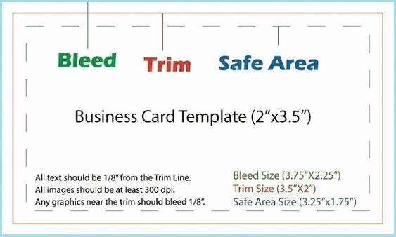
(source: pinterest)
3. Logo and Graphics Placement
Logo, being the visual identity of your brand needs to be in the limelight wherever you take your brand. The same goes for the business cards, the logo should own a center space on the cards to reflect your business identity. In most of the business cards, the spare side is donned completely with the logo complimented by a subtle background. It is good to have the logo on both sides of the card.
It is a psychological fact that shapes and colors capture the eyes before the simple text does. Make sure the logo is captive enough to arrest the eyes at first, and rely on a professional logo designing firm for your requirements. While finalizing the logo from the logo designing firm, ensure the design is small yet impactful, do not force too much inside the logo and at times it is better to go with the acronyms.
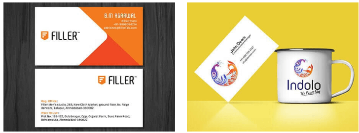
To make the card look appealing to the eyes, one can go with complimenting graphics without compromising the text, card space, or logo design. Paying complete heed to the shape and the size of the card. For instance, some businesses leave a noticeable yet intriguing graphic (on the other side of their business card) with the URL of their website.
4. Give Necessary Information
This is the major purpose why people distribute their business cards to our potential clients. The crucial information prevailing on the top of the card – your company name, your name, designation, contact information, office address, and social media links will make it easy for the concerned person to reach out to you.
A business card is an offline advertising tool that will drive traffic to your social media pages, this is a lucrative opportunity for you to work on your social media marketing strategies and convert them into quality leads. The same goes for email marketing in the B2B sector.
As said, it is important to know how you will communicate with your potential clients. Given that you have a compact space, here is something you might not want to miss.
| Company Name | The company name with a logo is how your business will be identified by your clients. Moreover, if you are a freelancer, you can skip this part. |
| Card Holder’s Name | The name of the person is inevitable on a business card as the enquirer will address you by the name as and when they are putting a query. Moreover, a representative is a must for any business (especially B2B sectors). |
| Designation | The standard business cards always hold the designation of the cardholder (owner, CEO, MD, etc.) this helps the other person to know how you are related to the company and what you do. |
| Phone Number | Still,l this is the easiest way to reach out to a company. In the run for fancy, do not forget to mention this next-door option for your client to instantly approach you. Email and social media channels do not support conversations as much as phone call does. |
| For the B2B buyers, this is the apt option to reach out. Keeping an email establishes you as a professional in your field. | |
| Address | It is easier for your customers to reach out to your office and have a face-to-face business deal. |
| Business Vision | A catchy sentence that depicts your entire business goals. For instance, turning dreams into reality. The slogan is a thoughtful one-liner that impacts your clients while telling about your services. |
| Website URL | Now that you are bound to give only the necessary information to your clients via the business card, it is wise to give them a link to your website for deeper insight into your products/services. |
| QR Code | Another way of transferring more than just the contact information about your company. There are various benefits of QR codes one of which is providing additional data. |
5. An Ideal Typography
After you finalize the information, it is time for you to decide on the topography for your business card. Typography includes text size, fonts, and color pallets.
-> Text Size – In the run for fancy, one must never forget the readability of the text that includes necessary information and guidance. Given that the size of the card is compact, it is ideal to go with 8 pts (below this one might compromise the readability factor of the card). The correct placement and size of the text leave enough room in between the elements making the surface look clean.
-> Font – Just like the text size, text font is vital in enhancing readability at first glance. Make sure your clients are not struggling with the words or the numbers you have mentioned for them to contact you. As your business card is your business offline identity make sure to keep the fonts subtle and professional.
-> Pallets – This is where one needs the color scheme. The text color should contrast with the background for easy readability and also should match the logo of your company even enhancing your branding. The palettes when placed in a rhythm create a sense of calmness in the eyes, eliminating the need to stress the text.
6. A Finishing Touch
Sometimes the outstanding element of a business card is its special finish that goes out of the way to have a never-ending impression on the clients.
Here are some special effects that you might want to consider:
-> Embossing – The technique to create a 3D effect, highlighting the content you want your clients to come across first. With this technique, certain areas pop out diverting the eyes to that particular region.
-> Letter Pressing – The technique results in something like the engravement of the text driving attention to the crucial information that the card holds. Especially useful letters, giving a weightage to your meta text. You can imply the technique on the logo to highlight it.
-> Foil Stamping – If you are aiming for gradient or reflective images, words, or logos (like tin foil) then you can go for foil stamping. This works well if the background has bold pallets.
-> Spot-UV Coating – Applying the UV coat on certain areas of the business card to make them reflect while in light. If you are not playing with color schemes, a UV coat is the best way to create a contrast between the design and the background. The technique is tricky when it comes to setting the composition of normal and shiny areas.
7. Reach Out To A Designer
For a business to reach heights it is important to look at every aspect of it (even business cards). Foremost, logo designing – an innovative logo speaks for your brand. Get the help of professional logo designers to start on the right foot. For a business card make sure you outsource your tasks to insightful hands too. Logo and business card designing are two affordable services that will fetch you good ROI in the future.
The sincerity in your logo and your business card establishes you as a mature player in the market and B2B buyers are more likely to relate to the brand’s existence in the market.
8. Finalize The Card’s Design
Work with your designer to assess which design will represent your business on the grounds. Colour choice, special effects, text/logo placement, CTA, and a lot more. Make sure every element is in harmony with one another.
Examine the Flow – How do your eyes and mind perceive the design? A good flow must start with the company logo, then comes the name and slogan (if any), the contact details of the concerned person, designation, and other secondary information. You can alter the fonts and text placement to make it seamless and appealing to the eyes.
Cross-check for the pitfalls – Is the card too vibrant? Or too mundane? Is the text readable? Do the colors clash? Is the design or the logo overlapping with the edge? Is the QR/website link clearly visible? These factors are to be looked upon and sorted while finalizing the design of your business card.
Go Smart by…
Avoiding the Borders – Though not impossible but it is equivalent to hard to cut the edges of every business card perfectly and a cutting error will do more harm than good. Your best bet here is to design with bleed and safety areas.
Save the cost on Colors – If you have a pre-set budget and are adamant about outreach the limits, make sure you do not wind up compromising on materials or quantity rather than go miser with pallets. The more colors you add more prices go up. You can experiment with one or two subtle colors and give them a special effect for impact.
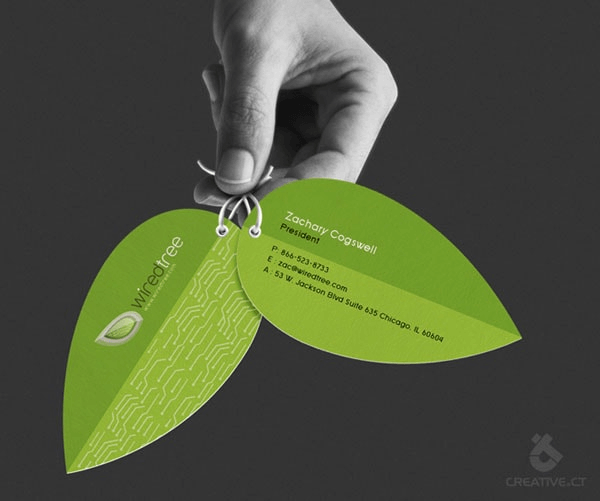
(source: designmodo)
Thus, by implementing all the points you can design the best business visiting cards for your company. You may not have the proper knowledge to have such professional things for your business. But by reading our articles, and blogs and connecting with our expert team. You can have the best things and save the cost to have the designing services for you. Whether it is a graphic designing service, logo designing service, or branding service- you need the expertise and creative work to be done for your company. When you implement all the things that professionals have suggested. You will be having the best services you deserve for your company.
Conclusion – Thinking Out Of The Box
In order to design a business card you need to have the creativity and the best tools. It may be a little difficult to design services for you but the experts can help you with the best services you need. You can make things easy to design a business card that you are looking to have for your company. Our added all the points above will help you with the best thing you are looking for.
Aforesaid are the 8 steps to design the best business card for your company, apart from that, there is no harm in thinking outside the box with your business card ideas. In fact, people never forget what is unique and outstanding.
Stand out of the league of normals with a clever idea for your card – induce advanced techniques like scented inks, duplexing/ triplexing the cards (making the card thicker), product-shaped cards, replacing the paper with metal or plastic, and transparent cards.
Business card – the card used when it comes to business. A business card is one of the traditional ways of doing business but still holds authority and therefore it is not worth it to compromise with the design of your business card.
There are several instances when you get to meet the person once and you have nothing but the business card to give them for future reference – this crucial asset should be taken seriously. Make sure you hire skilled business card designers to create a business identity card for you.
VerveBranding can be your one-stop solution for branding and designing because we have decades of market experience and a team of experts who, over the years, have worked on many major and minor projects for all types of industries. We provide designing and branding services at the most affordable price. For services related to mobile app development or web development and online marketing services, check out our subsidiaries, VerveLogic and VerveOnlineMarketing.

