Lawyer Logo – Creative Lawyer Logo Design Tips
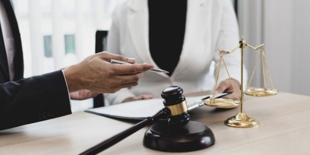
Nobody would love to see a colorful law firm logo if it is just for fun. An insightful logo helps you outstand in your league. And for a lawyer or a law firm, the logo needs to hold similar potential. A firm logo is meant to create a strong first impression and match the level of excellence a lawyer builds over the years. Therefore, as a reliable logo design company, we create influential personas and give them the shape of a logo. Based on the research, we make logos that help people easily recognize your brand in the year 2023.
How Custom-Designed Logo Is Good For A Lawyer’s Profession?
Law firms represent strength, power and trustworthiness. And branding along with logo design is the best way to create that reputation. Infact, the expert designers believe that logo plays with the psychology of the human brain, making them feel how they feel looking at the logo. It is beneficial for a lawyer’s profession to make people confident about the services. Often the factor is missing with the generic or poorly designed lawyer logos.
As per the article in Lawyerist, most lawyers and law firms underestimate the power of a well-designed logo. Thus, they stick with generic logos or use the brand name as their logo. On the contrary, the poorly-executed logo designs significantly affect their reputation in 2023.
Standard Elements In Lawyer Logos
It is justice scale, the law court or just the lettertype that represents most of the lawyer logos. But, is this enough to create a link with the onlooker? Expert logo designers are known to scratch their brains for creative results. Exploring the possibilities. Logo ideas and concepts are often unestimated in this justice segment. But with generic logo design, there is a threat of going unnoticed for your services. Logo is an indirect marketing tool, making people apprehend your services. Generic logos with a handful of standard elements (shapes and fonts) fails to attract the audience.
Tips For Designing Lawyer Logos
As a lawyer, you have spent years building your reputation. It is for you to understand that it is the year 2023, and you don’t need quality services but quality presentations as well. Vervebranding ensures the same is communicated through your firm’s logo. Here are some tips for lawyer logos, fresh from the desks of professional designers.
Wise Selection Of Colours
For a lawyer, it is important to maintain trust and make their clients confident. One of the sure-fire ways to present the values is using the right colour pallet. Go for black or peers of black. Or prioritize navy blue, grey, brown, beige or yellow. Refrain from extra vibrant colours as they weave off the professionalism from the logos. Judiciary is a wing of the government. It is possible that the colours emit patriotism.
A Single Shape
Expert logo designers believe in minimalist yet influential logo designs. How is that possible? It is by merging all the major values under one single shape. A single conceptual design can become the virtual face of your law firm.
Mentioning Initials Is The Best Practise
The only common trait of the best lawyer logos is mentioning either the name or the initials of the firm. It is indeed a good practice. Vervebranding says, “in the era of the internet, it will help people know the name, so they can Google immediately for details – as and when they come across the logo”.
Using Strong/Bold Fonts
Heavy fonts like Times New Roman, Public Sans, Goldplay, New Sans, etc, resonate with strong personas. As claimed by the best logo design company, every element of a logo design emits a value, a trait, a characteristic. Bold fonts raise the feeling of strength, power and reliance.
Standard Symbols
It is beneficial to use standard symbols in the logo. At the same time, you run the risk of being stuck with a mediocre brand identity. Holding a creative edge, the affluent logo designers scratch their brains for innovative ideas to use standard symbols that communicate values.
Characteristics of Lawyer Logo Design
A lawyer’s logo should reflect authority, trust, and decency. A lawyer’s logo design should be easy to understand for clients. There are not many elements that can be used in a lawyer logo design but consulting a logo designing company can solve this problem. A lawyer logo ensign must have the following elements in it.
- Professionalism: Lawyer logo design should project an image of professionalism and trustworthiness. They should convey a sense of trust and reliability and should be designed with a classic, timeless look.
- Authority: Lawyer logo design should also imply authority and strength, as they represent a professional who is well-versed and knowledgeable in their field. Logos should be designed to convey a sense of authority and trustworthiness.
- Simplicity: Lawyer logo design should be designed with simplicity in mind. They should be easy to recognize and remember and should be designed to be eye-catching and memorable.
- Balance: Lawyer logo design should be designed with balance in mind. All elements should be balanced and harmonious, with no element overpowering the rest.
- Color: Lawyer logo design should generally use neutral colors, such as black, gray, white, and blue. Bright colors should be avoided, as they can be distracting and appear unprofessional.
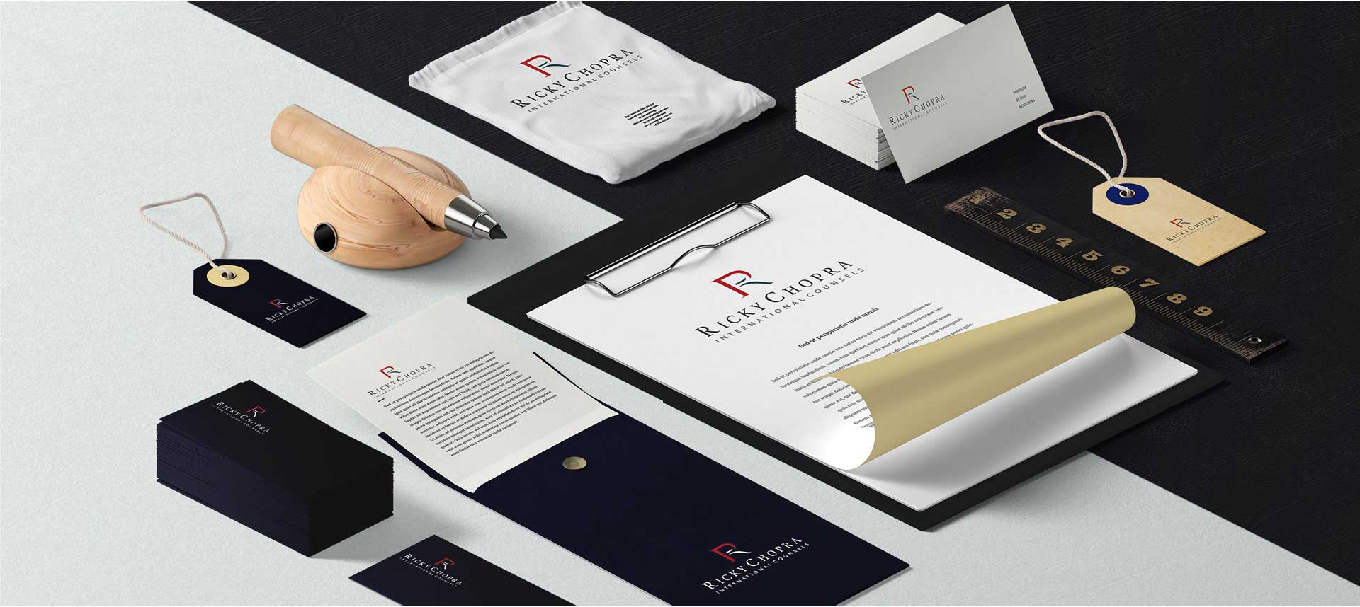
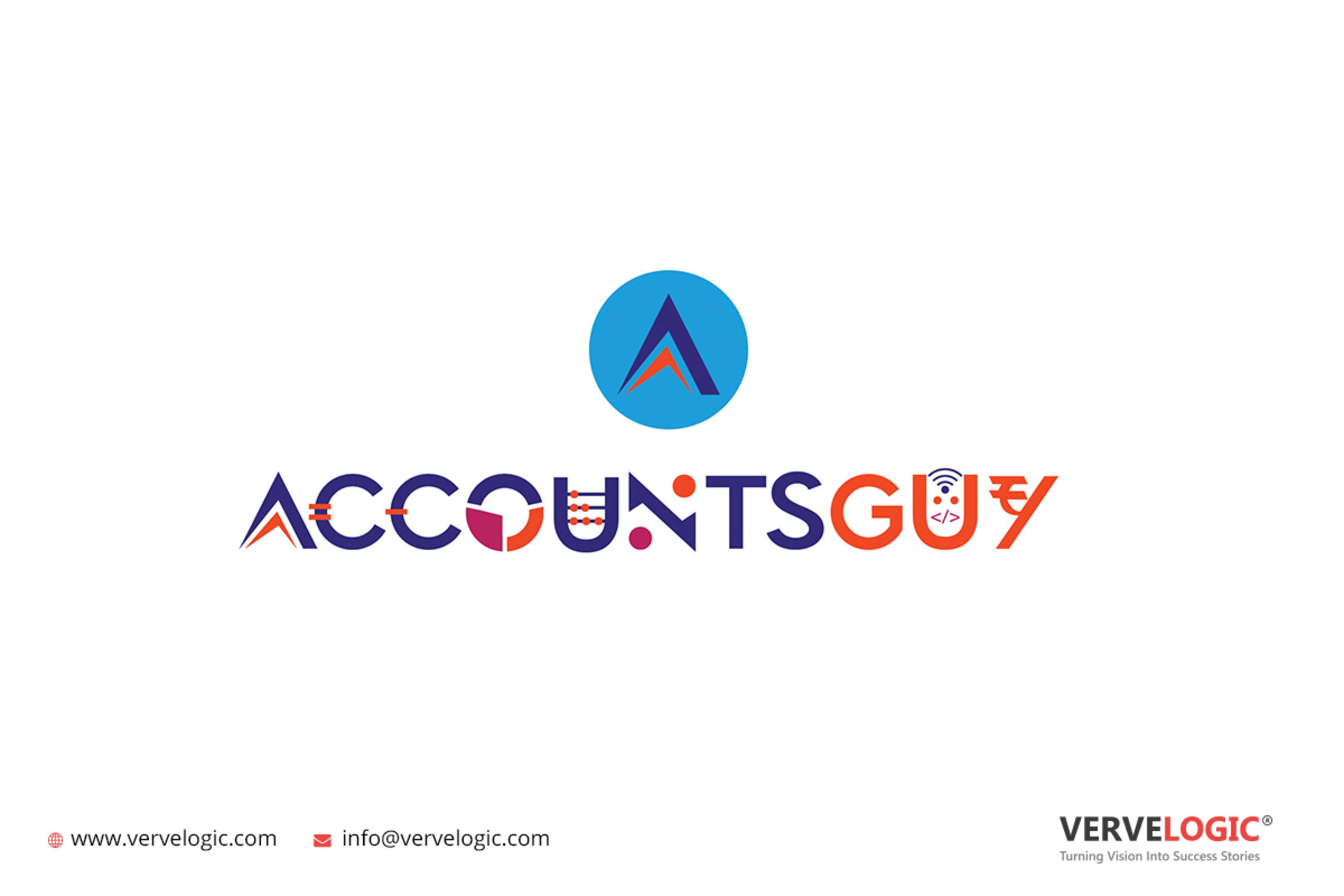
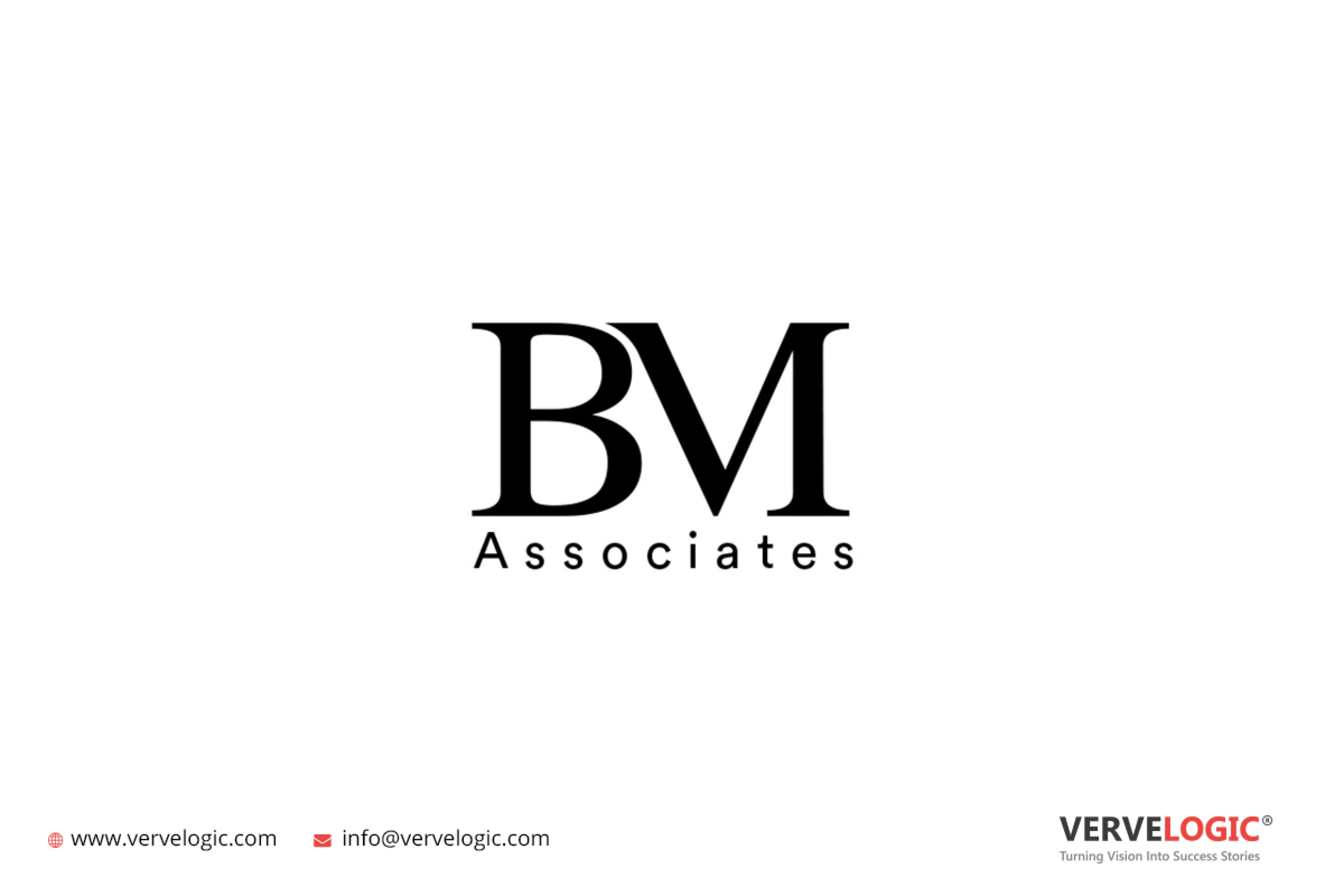
Innovative Lawyer Logos Designed By Vervebranding


Get A Striking Lawyer Logo – Conclusion
The last section shows you some Lawyer logo design ideas delivered by Vervebranding. Without the box thinking, we aim at delivering strong logo concepts that represent your authority in the segment. Moreover, you can avail of more than 1-4 unique logo concepts to make your best bet.
Also Read: Cafe Logo – Creative Cafe Logo Design Tips
Architecture Logo – Creative Architecture Logo Design Tips
Real Estate Logo – Creative Real Estate Logo Design Tips
Fashion Brand Logo – Creative Fashion Logo Design Tips


