Logo Designs that have turned into their Simple Forms
Nowadays, it has become a trend for brands to change their logo in order to match up with the industry trends. If you are working in the field of logo designing like logo designing company, then you must have known that complex logos marks as a distant memory, whereas the logos that are much simple and clear cut, are easy to remember and defines their brand for a long time.
Last year and even this year, we have observed that there are plenty of brands who have changed their logo and made them much simplified. So, here we have shortlisted some of them for you to take inspiration with their simple and unblemished forms.
Royal Albert Hall
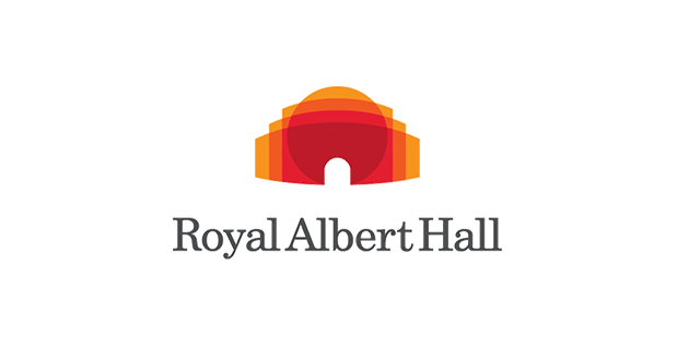
Royal Albert Hall, the renowned London Performing Art Centre had drawn the attention of a huge audience with its new appeal and of course the new logo.
According to the authorities, the purpose of this change is to underline the reputation of the centre as a world class venue since the institution has started working with strategy consultancy firm BrandPie’s charity arm.
The unique silhouette of the hall has been featured through their new logo which is designed to move across the media. While the new logo is much simpler than the old one, but it appears cleaner, smaller and also shows five shades drawing a complex silhouette.
Verifone
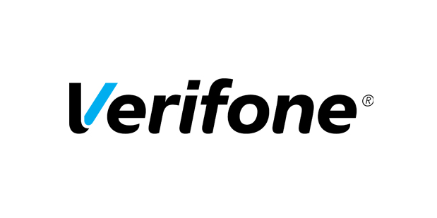
Maybe God knows and yes the Verifone authorities must have known the purpose behind those angular shapes that were shown in the previous logo. With their new and simplified form of a logo, we can say that finally they have realised their mistake and made up with a great idea of highlighting the V of Verifone.
Daily Motion
One of the popular video platform after YouTube, Daily Motion has finally come up with their new logo that eliminated its icon and came up representing its simple wordmark logo. Daily Motion boasts 300 million viewers on its player and around 30 billion views each month around the globe, so it was a definite need of a simple and clear logo.
Integrated Research
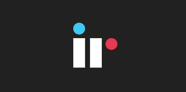
The Australian company which is also known as a global leader in proactive performance management software has truly adapted the idea of simplicity which can be seen through their logo. Its old logo was representing a green coloured monogram with company’s full name. On the other hand, the new logo is simple featuring geometrical shapes along with the initials of the company that results in completely confident and contemporary appeal.
Integrated Research has shown a great example of unfussiness while using three shades featuring the superior malleability and sophisticated character of the company.
Banco Popular
This association stands as one of the biggest bank in Spain and with their new logo they bank has really reached beyond the boundaries of simplicity. Their other part of the name “Banco” has completely removed from the new appeal which just shows “Popular”.
In logos, the slanted line is often appointed beneath the logo that works as an exceptional visual device enabling the logo design to stand out against any sort of background, whether its solid colour or comprises some effects.
Open Table
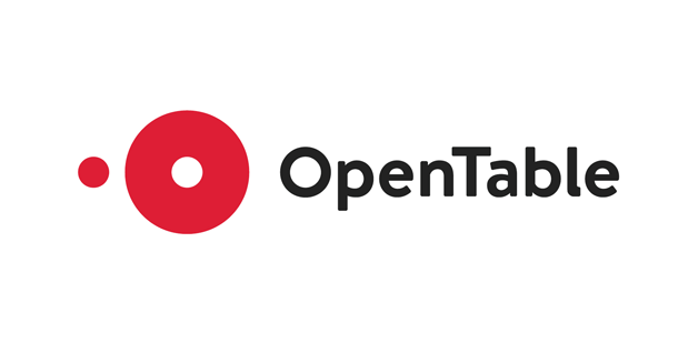
Ditching its old logo outline completely, Open Table has now evolved into a new form that does not have any three-dimensionality or linear standpoint. Going along with the flat designing trend, the new logo performs tremendously against the plane of the screen, while highlighting the fact they serve to help patrons to find their perfect fit.
If you have any other best example of logo change, then leave in the comment section below!
And we, the digital marketing company will be right back with more logos!


Thanks for sharing this useful information.