The Mechanics of How Car Logos Are Made

There is no denying that logos are the master behind designing the brand identities in any industry. And the automobile industry is no different. In Fact, logos are more important in the automobile sector as compared to any other industry. We all easily recognize brands like Hyundai, Ford, Kia, Tesla, Suzuki, etc., just by glancing at their logos. The car logo design has amazingly upped its game since its inception. Not to mention the sophistication on the logos of some top brands like Mercedes, Ferrari, BMW is simply excellent. It shows the benefits of creating something unique and memorable at the same time. Like the automobile sector, if you have an appealing logo from the top logo design company, you can have marketing and branding strategies that deliver results.
We have seen how people easily recognize these automobile companies worldwide because they emphasize creating logos that stand out everywhere and everyone else. Let us dive deep and understand more about automotive logos by learning the mechanics of how they are made.
It Starts with Research
Research is an integral element for every business before creating a logo for their business. Similarly, car logos can’t be completed without proper research in the automobile industry. The company owners share their vision, ideas, and what they expect from the logo to deliver. And at the same time, the logo designers perform research on their own based on the data fed to them. According to the experts, researching is crucial as it can make or break the logo, especially in the automobile industry.
Thorough research allows you to improve your brand identity design in many ways. Like it gives you an idea of what your target audience likes and whatnot. You can figure out what’s and what’s not working in the industry by considering your competitors’ business. Research also allows you to understand whether you are unknowingly copying other logos or not, and it will take the unique element out of your car logo design. Apart from these benefits, you also know about the current logo trends and give you an idea of what can work in your favor. So, do your research well, and you can end up with a striking logo for your automobile brand. Some top examples of thoroughly researched car logos are Audi’s Rings, Honda’s iconic H, and Aston Martin’s wings.
Logo Styles
Logo styles are another vital factor to consider while designing a logo. If you are intrigued by Nike’s swoosh and Cola-Cola’s script, then welcome to the club because everyone loves these kinds of logo styles. These two companies have effectively used these logo styles to attract customers worldwide.
Coming back to car logos, combination and emblem logos are pretty famous in the automobile industry. But it doesn’t mean what works for others may work for your brand. As the leading logo design company, your car logo design must represent your brand values and send the right message.
For instance, the Toyota logo is a combination logo, while the Ford logo is the company’s name highlighted in a blue background.

Image Source: Toyota
If you consider the Volkswagen logo, you can see the ingenious work behind its design. Its trademark V and W are beautifully linked together in a circle that strikes right in the customers’ minds.

Image Source: Volkswagen
Icons Or Symbols
Icons and symbols also significantly impact the automobile industry as they can combine design elements. When it comes to the automobile industry, abstract shapes like symbols, icons, and animal characters can work wonders, as we have seen many examples of this kind of logo. You may have seen emblems with shields or animals such as bulls, horses, and jaguars in the car logo design. Using these elements in logos means your brand needs to emphasize speed, strength, and power, just like Jaguar and Lamborghini. In designing car logos, designers and brand owners have to pick out suitable automotive icons and symbols that will represent the brand well.
Other examples of this type of logo are Shelby Cobra and Impala’s antelope, as their idea is to show energy, force, and quality through their brand.
Shelby Cobra is considered one of the best in the automobile industry for creating the most iconic American sports car in history. The famous movie Ford vs Ferrari was created on one of the same instances when Shelby and Ford Motor Company partnered to create a fast 427 FE motor to win the championship.
Even the car wash services use such logos to stand out from the rest through this design so people can easily recognize them with symbols. Wrenches, gear or speed signs like fire and abstract lines can help attract consumers and also tell them about the services you might be offering.
Image Source: vervebranding
Image Source: vervebranding
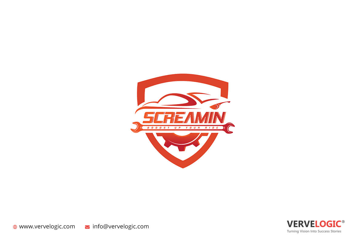
Image Source: vervebranding
Image Source: vervebranding
Image Source: vervebranding
Color Schemes in Car Design Logos
The use of colors in designing is crucial for branding purposes and to engage the target audience with your brand as you know that each color has its meaning, and each of them triggers different emotions in the user’s mind. Now it’s up to you which emotion you want to start and announce when consumers have a look at your logo.
Most car logo designs are black, and silver as silver represents sophistication and elegance, two significant traits people look for in cars. At the same time, black shows control and power. However, how you design your logo also matters.

Image Source: Mercedes Benz
The sheeny silver of Mercedes Benz stands for luxury and style, which means every customer knows they are buying the best in the business.
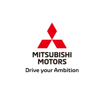
Image Source: Mitsubishi
However, Mitsubishi’s crimson logo is red, which helps them establish themselves as confident and achievement. So, choosing the right colors can make them look appealing.
These two car sellers make use of colors in the logo amazingly. As you can see the colors and contrast are mingled together to create an engaging logo which the audience love to see as it gives it a unique appearance and sets them apart from the others.
Fonts in Car Logos
You may be considering what’s in the font in a logo. But if you want to target a specific type of people for engagement, then fonts play a significant part. The logo design company believes that the audience’s visual attention is meant to be necessary for every car logo. It not only gives a feeling of trust but also establishes the brand’s reliability.
However, you might have noticed that automobile businesses usually have logos in clear and bold fonts like Sans Serif as it easily captures the consumer’s mind.
Image Source: Wikipedia
Cadillac, one of the biggest car makers in the whole USA, has picked unique cursive fonts just like Coca-Cola. However, according to the owners it was used as it represents the company’s history and tradition to the consumers.
Font styles are also important for car dealers as it helps them in detailing their logos and make it specific for the users. It’s a great technique that users manage to catch the eye of the consumer especially when there is a lot of competition.
Adaptability in Car Logo Design
The last factor that’s super important for car companies to consider is adaptability. Every automobile industry is planned for a long-term plan. What happens if their first car doesn’t work out? They are not going to wrap things because any new idea can easily change the course of the plans. So, a logo needs to be created so that it’s adaptable with time and doesn’t need an update now and then. Keeping the logo also helps with comprehensive brand strategies.
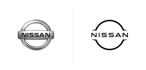
Adaptability plays a major role, especially in branding and marketing. See Nissan’s new logo as the new appealing design. It is not only good on cars but also is perfect for merchandise such as clothes, bags, and digital media for marketing purposes.
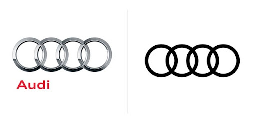
If you observe both these logos of Audi then the first is the earlier logo of the company and the second being the redesign. The first design has metal rings and the later one is more adaptable to digital platforms and is user-friendly.
History Creates Great Car Logos
The biggest and probably oldest automobile companies in the world have used different kinds of logos over the years. These logos represent the rich histories of these companies and as a business owner, you can also include something unique or a family tradition in your brand logo symbol and make it interesting among the users. Let us have a look at some famous stories behind some brand names.
1. Ferrari – Do you know that the Ferrari logo and the colors used in it represent three major things about the owner. First the founder’s hometown, then the time he spent in the military and third his experience before starting the company.
Image Source: ferrari
2. Alfa Romeo – Another symbol that tells the story as it shows a man being eaten by a snake and right next to it is the Christian cross.
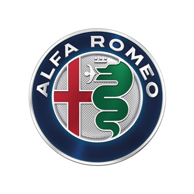
Image Source: Alfa Romeo
Endnotes
This is the mechanics of car logos. If you believe that your enterprise must also leverage the benefit of a logo then hiring a logo design company can do amazing things for your business.


