Peeping Into the Past: A Brief History Of Logo
For you and me, logo design is the thing of the modern world. It is a simple, iconic image that helps to represent individual brands and companies, right?
But is a logo really a thing of modern times?
No, absolutely not!
Humans have been identifying and differentiating themselves by using emblems and signature marks for hundreds and thousands of years. Much of symbolic design work throughout recorded history is all about communicating and identifying visually.
The modern-day logos are quite different from logos of the past, but the concept is still the same, to create an identity that is easy to get distinguished.
In modern business, we need a logo to represent ourselves in front of the vast customer base. But this tradition actually dates back right from royal families, hieroglyphics and ancient religious systems. This post is dedicated to giving you a tour of the historical lanes of logo designing and also helps everyone who is looking for designing a logo which is creative and powerful at the same time.
The Ancient Foundation Of Symbolism In Graphic Arts:
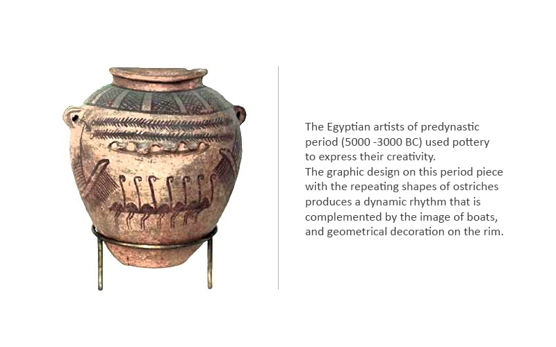
We all know that between 70,000 BC and 7000 BC, people of that era laid the foundation of graphic art by painting various human and animal figures in caves. People from Egypt, Persia, Sumerians etc., created various pottery to communicate their ethics, culture, and tradition within themselves and across the world.
Even in this ancient time, studying the stretch of history reveals that people and cultures were represented with ideas, symbols and
illustrations. This process got more prominence in Ancient Egypt beginning in the fourth millennium BC. Logo makers (which we can call them in terms of the modern world) from the Egyptian era developed hieroglyphics which was a formal writing system, where images represented certain kinds of sounds and words. These paintings included specific images and colors that help with some really specific meanings.
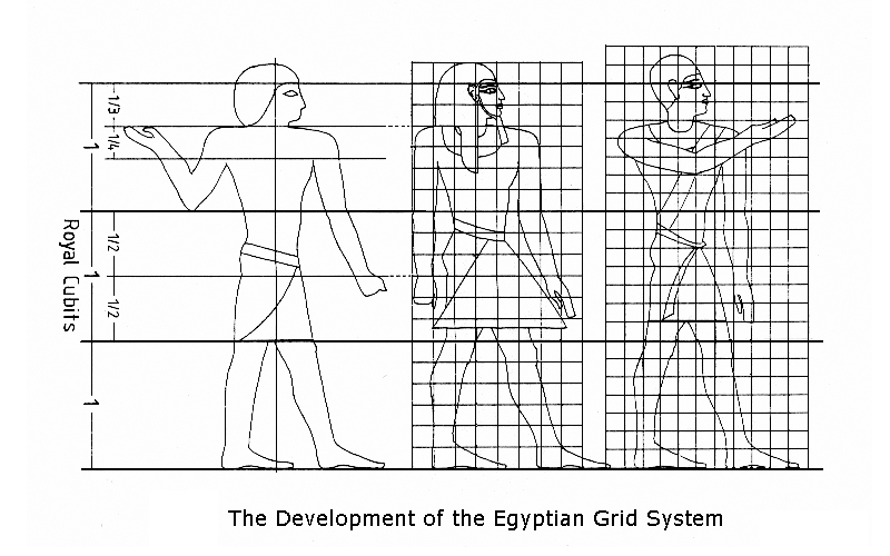
In the era of 2125 and 1991 BC, grids appeared in Egyptian design. This era is considered really crucial in terms of logo design because this era ensured that artists maintained a balanced proportion and ratio and got a uniform reproduction of the design.
Logo illiteracy legacy
In medieval Europe, two distinctive visual languages were used: heraldic crests and symbolic signage. Heraldry is a system of assigning various design elements which have a societal meaning and significance. The color palettes used in these shapes would represent the Nobel family. These images combined with colour were used to create a unique coat of arms.
Isn’t it, what a modern logo does?
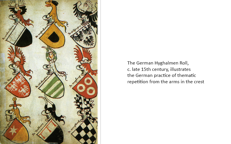
The purpose of using this imagery was entirely different. It was done to identify the enemy and friendly army bases during the time of war. Expert designers from the best logo design services highlight that at this time the design element started to get meaning and helped people identify their favourite side. This process can be understood as the implementation of the modern idea of a logo!
In the middle of 900-1300 AD apart from the aristocratic population, most of the people were illiterate, but the population started increasing leading to the building of more and more cities. From agricultural practice, the concept of trade emerged. Trade brought more commodification as people cannot have every object they needed.
The concept of shops developed with hanging signs to make people understand what goods or services they sold.
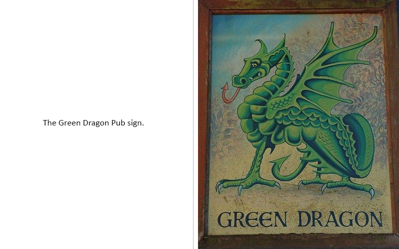
In 1389, King Richard of England brought a rule that required all the established brewed beer shops to hang signs that indicate the potential risk of drinking. This is the way we see businesses of that era differentiate themselves by adding heraldic images to their sign boards. One pub became, the green dragon and another one two cocks.
The images used in this era are not as specific which is those used in recent times, but this obviously tells about the way history is taking a turn.
Paper And Textile Industry- A Step Further In Development Of Logo
In 105 AD paper making industry began in China. In 610 AD it extended to Japan and then in 1276 AD it reached Italy eventually the production of paper and its influence on industry began in 1495 AD.
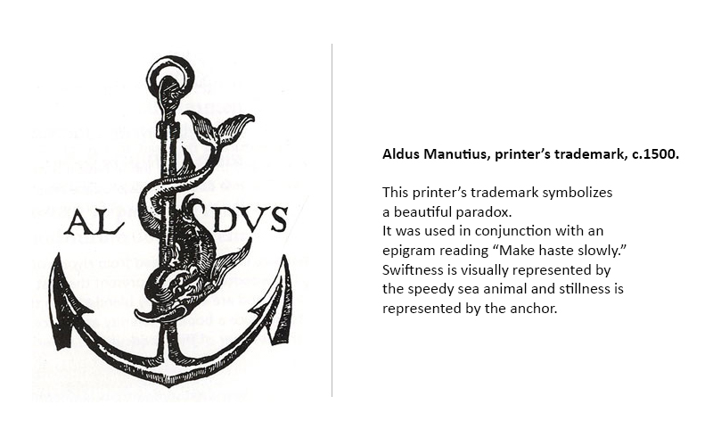
 Johannes Gutenberg invented the printing press in 1940 which lead to the production of printed materials. This development set the stage for modern logo design as authors and printers of material would have a clash in the ownership of the work. By the 15th century, various printers took the help of logos to distinguish themselves.
The stage of industrialization and the combination of advertising
(industrialization + advertising= early branding)
The industrial revolution is all about the discovery of steam engines, factories, and cotton gins. But you must be thinking, you know about it, then?
We say this was not all the discoveries which were made in the nineteenth century.
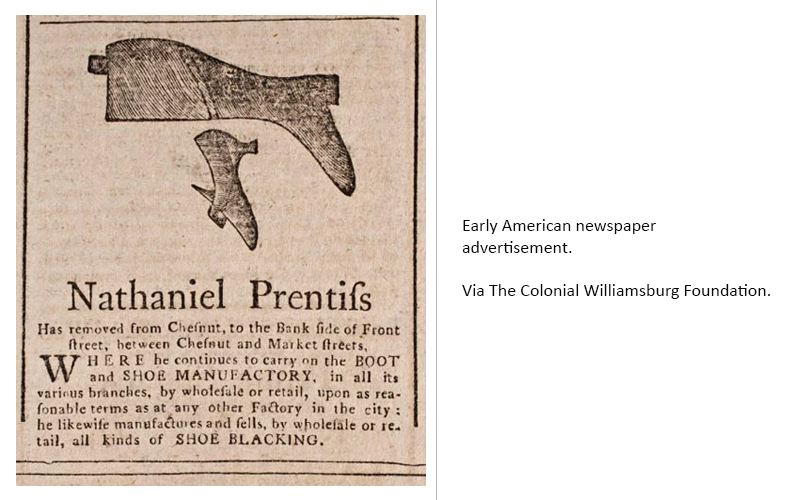
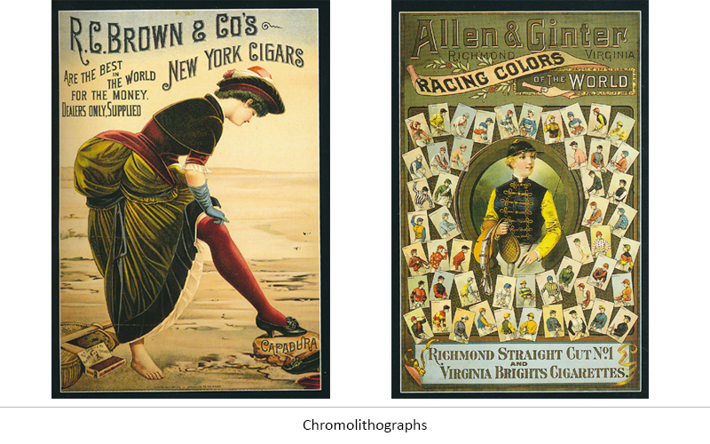
In the 1800s, mass production of printed material was done by making changes in the structure of the printing press and new designs as well. The industrial revolution came which upgraded the middle-class status.
Apart from the elite, the middle class also started getting disposable income. This was the situation that led to an increase in retail and urban centers. This increase in the number of businesses also led to an increase in the need for the branding process.
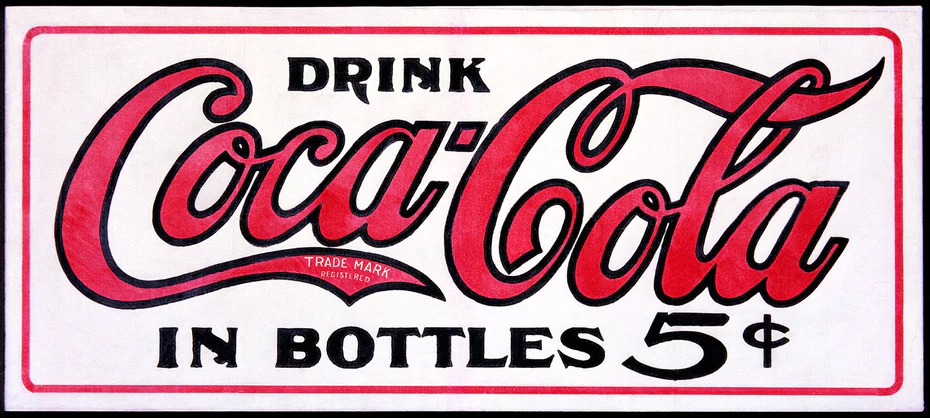
Frank Mason Robinson designed the Coca-Cola logo in 1885 which marked the modern era of logo design. The logo was so popular that it ruled the mind of people then and now.
Consultants from the best product design services consider the logo and product design of the Coca-Cola brand to be the most iconic and most recognizable brand throughout the world even today. This iconic branding of Coca-Cola had magic of a unique design which associated with the company more like a soul.
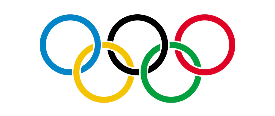 After this, it was never looking back. Within 1910 and 1913, commercial logos acquired the whole US and Europe markets. In 1914, the logo design moved a step further surpassing the commercial market when the Olympic logo was created. This way logo was boundless from the hands of commercial usage only and showcased better cultural significance.
An Era Of Creative And Thoughtful Logo Design Began
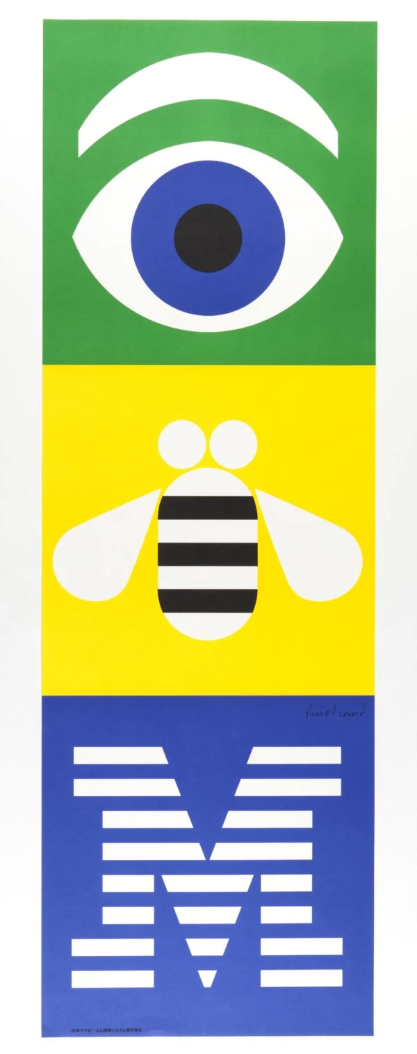
There are many experts in logo designing consider 1956, Paul Rand designed the most iconic IBM logo depicting a human eye and a bee. A maximum of logo historians hold this design as a turning point in the world of logo design.
Be it any industry, in the 1950s a considerable amount of thought processes surrounding the logo changed.
Experts from best banner design services highlight that as the amount of competition increased in the market, companies started to realize the importance of an impact symbol and its extensive usage. This is the reason that people started creating utilitarian logos for simple identification and switched to a great deal of intentional branding of the business.
In 1960, many thought leaders from the graphic designing industry joined hands for creating a thoughtful logo design and decide to collaborate to enhance the level of the industry and its design.
Putting this work by name, they established an organization in 1962 which was D&AD, Design and Art Direction. Between 1962 and 1964, the company successfully created some of the first computer art which was obviously a step ahead for today’s world of logo design.
Thereafter, in the 20th century, we saw logos become a must for business. In order to get the maximum of customers, a unique logo design was a must.
The Beginning Of The Digital Era Bringing More Adaptability And Style
In the 1990s the popularity of personal computers increased significantly and by the 2000s Adobe introduced InDesign and Photoshop tools that brought even more sophistication to graphic designing tools meant for the masses.
With the change in technology, society also changed. People started getting more and more inclined to media and media on screen. This was the reason that designers and brands started giving emphasis to create logo designs. For example, it was MTV came up with a basic logo but made sure to change it constantly.

In the early era of the internet, designers helped people to easily adapt to changes by making easy changes on a screen which could look similar to off-screen. This kind of design style was known as skeuomorphism. This style got manifested in gradients, drop shadows, faux wood and metallic textures etc. to bring more depth to the idea.
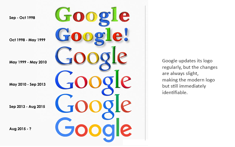
However, this pattern changed in the 2000s with the rise of Web 2.0. This term is itself sufficient to refer to the shift in how websites are developed and technology was used, this way a visual movement was created.
As the world moved ahead we all went comfortable with new technologies, and it was not necessary to mimic a 3D space in a 2D world (we can do it in 3D now!). This is the time when the flat design came in.
Flat design in the first stance would look like going back in the time of design. The element of these styles dropped stylish characters like shadows, textures, and gradients that may seem to enhance the text and other graphics lift away from a computer screen or printed page. But the design made in flat or minimalistic design is way crisper, cleaner and more modern to help communicate the whole idea neatly.


The conclusion
Seeing the fascinating history of logo designing is really useful in understanding what is fueling our present design ideas. No matter how organic we feel they are, but somewhere they are connected to the culture and of course the past.
The most interesting part of logo designing history lies in the fact that despite having chronological roots, there remain so many things which are worth interpretation and still hidden.


You can definitely see your expertise within the work you write. The sector hopes for more passionate writers like you who are not afraid to mention how they believe. Always go after your heart.
My brother suggested I might like this web site. He was entirely right.
This publish truly made my day. You cann’t imagine simply how
much time I had spent for this info! Thanks!