The Evolution of Star Wars Logo
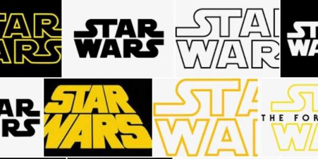
Stars Wars – A beloved name in the minds of sci-fi movie lovers from all around the world. Many people believe that Stars Wars is one of the best Sci-fi movie series in the whole world and a huge fanbase justifies this truth. Well, if you have watched the series then you must have an idea of what “Luke, I am your Father” means. There are a total of 12 Star Wars movies until now.
We are delighted that Oscar Isaac is not in every Star Wars movie because Carrie Fisher Slapped Oscar Isaac more than 40 times on the first day of the shooting of Star Wars: The Last Jedi. Aah! back to the topic cause a complete blog can be dedicated to facts on Star Wars as there are 12 of them. Well, looking at the length of the series one thing is sure Star Wars is not going away anytime soon and so does the Star Wars Logos.
First Star Wars:
A New Hope dates back to May 25th,1977. This means The Star War Films saga has been around us for the past 4 decades. This means only one thing we have a lot of logos to talk about. Since it all started in the 70s, we are going to get a history lesson as we can’t get it back in the 21st century.
Before you can say, Jack Robinson, let us straight away dive into the Star War Logo and take a look at how these Star War sagas are playing with their logos over the years. It is going to be a lovely ride for all the graphic design developers, logo designers, and the best logo design company as they are going to get a lot of amazing information and if you are a Star Wars fan just like me then I have nothing to say to convince you as you are definitely going to read it till the last.
Check out: Tips for considering the best logo design in India
The Original Trilogy Logos
1. Star Wars A New Hope
I am sure that the percentage of the readers of this post is not from the 70s, so you may have a little idea of how things used to work at the moment for logo designers and graphic designers. When the movie was in pre-production, concept artist Ralph McQuarrie’s team developed several logos before they finalized one by typographer Dan Perri.
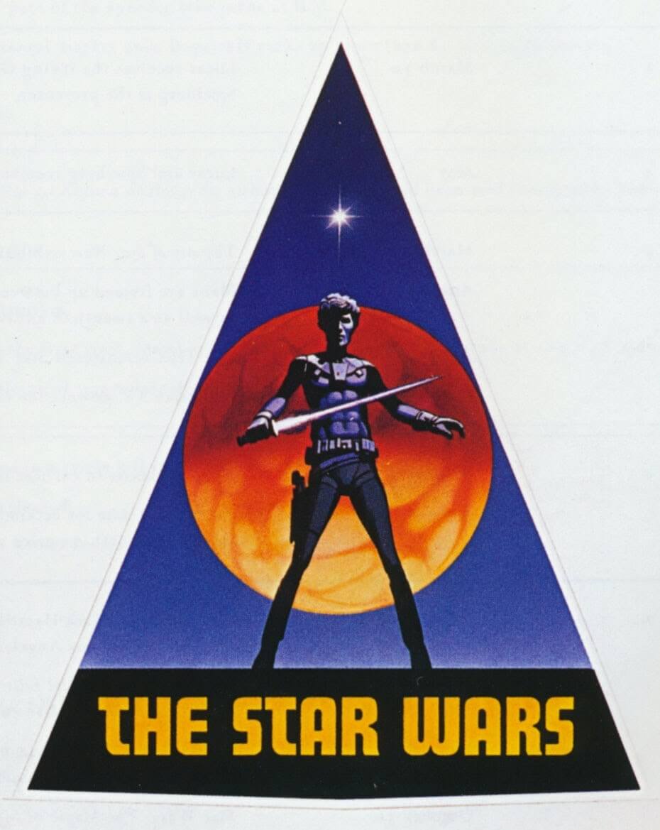
The yellow font used in the design is bold and striking which doesn’t give the idea of Sci-Fi. But it seems perfect as the Star Wars logo movie series is more fantasy than hard science. This can be one of the reasons why they went with the star overlaying on the top of the poster. Moreover, this design raises that “Pulpy” feel along with an eye-catching look, but it never made it to the final film.
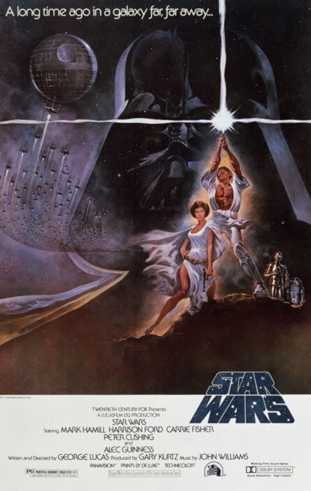
The First Star Wars Poster
More about Star Wars…
The first star wars logo which made it to the film screenings was developed by Suzy Rice along with the modifications done by Joe Johnston. George Lucas the famous director of the Star Wars logo series requested the logo to be more “fascist”.
Suzy Rice, who was studying German signage of the 1930s used those design techniques, a bold standard font, severe graphics together with hash lines to come up with one of the most Universal logos of the 70s.
Read also: Starbucks Logo – A Brief Logo History and What Makes it so Great
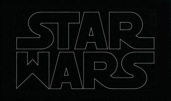
The Original Logo Created by Suzy Rice
The Revised Logo by Joe Johnston
If you are one who hasn’t watched the Star Wars series yet but still loves this blog then you might be wondering what this movie feels like. So, you can hop to the best TV streaming apps to watch live TV and to watch the Star Wars logo and find out why people love this series so much and why this installment is still going on.
2. The Empire Strikes Back
There was a time when not a single studio wanted to make Star Wars. At that moment George Lucas was nobody as he used to sleep on his friend’s couch, trying to hustle a pair of movies to any film studio that would hear him out. But unfortunately, there were no takers.
After the release of the first installment, The Empire Strikes Back became the most anticipated movie/sequel in the cinema’s history. If you do not call this a success then I don’t what defines it.
As per George Lucas “We were going to call it Star Wars: Episode II – The Empire Strikes Back, but we had three more stories we wanted to tell which occur before the point where the first Star Wars logo Begins. It could complicate things for the future.”
So, the movie was named Star Wars: Episode V – The Empire Strikes Back. And the marketing department decided to avoid the numbering in the poster and logo itself.
Also read: Top 15 World’s Most Famous Logos And Brands With Hidden Meanings in 2023
More about The Empire Strikes Back…
This time the poster doesn’t take on the fascist style like the first installment of the series. It follows an angled text which gives it a feel of adventure and speed in space with a curved front which gives it a proper sci-fi style of the time.
Your business card plays an important role when it comes to doing offline marketing. We understand that online marketing is on the rise but if you want to be in people’s minds all the time then offline marketing like carrying your business cards is also a key.
Regardless of which industry you belong to, a business card that consists of your logo will help in the brand’s recognition and its ultimate goodwill. So, we bring you the idea of how to design a business card – The ultimate guide, just for you.
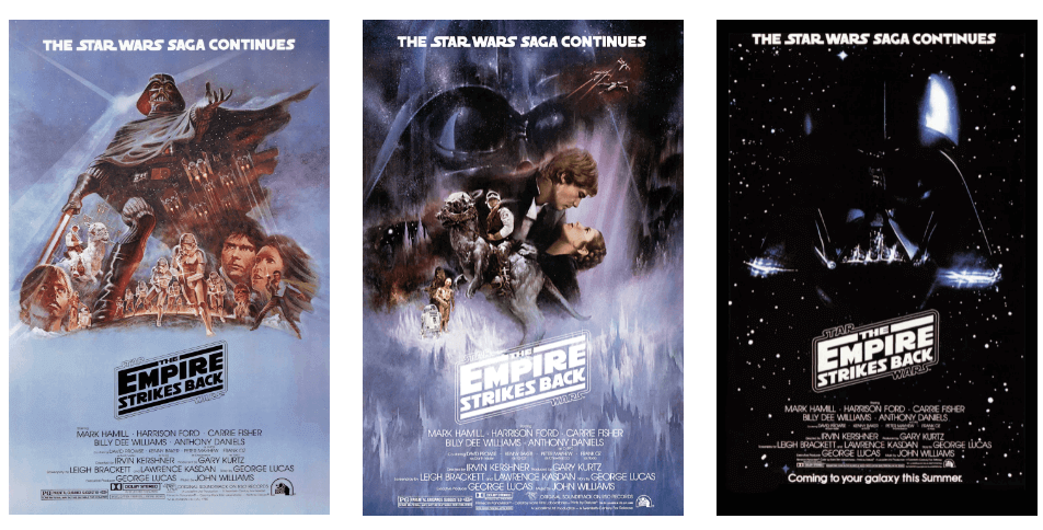
These three logos are considered the first true Star Wars Logo. It includes the creative design by Suzy Rice which gives it an innovative side from the first film in this logo’s border.
3. Return/Revenge of the Jedi
Just like the Empire Strikes Back, Return of the Jedi went through many changes before it came up to development. In the original script Han Solo died and also all the heroes visited a planet of Wookiees instead of Ewoks.
With all these changes in the final script, even the title changed the movie. Originally, the film was titled “Revenge of the Jedi”, but the studio changed it because of the upcoming sci-fi action film, Star Trek II – Vengeance of Khan.
If you are a logo designer from the best logo design companies then the logo looks like something you could create in MS Word in under 5 minutes. The designer only updated the color from yellow to white to red for the third installment which raises an ominous feeling.
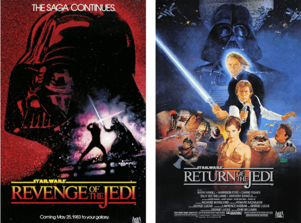
Unlike the Empire Strikes Back, the “Star Wars” text didn’t get included in the border. It’s just sitting there in the middle as the S floats off into space. It was one of the most backward logos out of the three movies. We really do not know what the logo designers and graphic designers were thinking while designing these posters.
There are 8 types of graphic design, here you can check out.
The Prequel Trilogy Logos
When it comes to the Star Wars prequel trilogy then even the filmmakers had no idea how many movies they are going to make. They have no idea whether it is going to be three films, six, or even just one.
When the prequel trilogy was released in the late 90s, Star Wars was established as a brand all over the globe. These films are a new set of films and the Star Wars logo offers something new and fresh of that time.
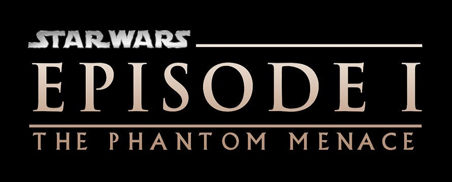
The best part of the original trilogy’s logos is they all put significance on the title of the movie. It helps the audience to remember the name of the film and helps the production house in marketing.
But there was a problem with the prequel trilogy at that time. The problem was to make the audience understand what a ‘Prequel’ is. Well, everyone has an idea what prequels areas The Phantom Menace wasn’t the first prequel movie ever but the modern audience wasn’t too familiar with this concept. And in order to make it familiar to the audience, these Star Wars logos place their emphasis on the episode number for the first time.

What’s more…
As the studio planned to have moved ahead with Episodes in between the name of the series. The huge EPISODE text can be seen on the logo along with the other cast so the readers can easily find it. And the actual title became the last piece of the hierarchy, hiding in small type across the bottom.
The only difference this time was that the logo design was consistent throughout this time with the prequels. Even the fonts, colors, and the design of all the logos from the logo design company were the same to make the audience understand that all these films are all part of a whole.
Moreover, if you are looking for the best video streaming apps for android in order to watch the Star Wars series. Then click on the mentioned link to find out where you can watch them. Video streaming apps are helping people get entertained at their best. With hundreds of available ways to get entertained, this blog comprises some of the best ones.
You should read this: How to Create a Brand Style Guide in 2023?
The Sequel Trilogy Logos
When Disney bought Lucasfilms for over $4 billion, everyone knew that it was going in a new direction and new changes were going on in this series.

The main obstacle for the new generation of filmmakers is to remind the audience why they liked Star Wars in the first place. So, the sequel logos look very much similar to the original 70s logo. The colors in the logo design, graphic design, and logo design all were identical. The numbers weren’t mentioned and the titles were deemphasized.
However, the new direction also deviates from the prequels in another important aspect: color. Green means goodness and the light side of the Force; red is just the opposite, which means bad and dark sides.
Also, read>> Why are there Seven Colors in the Rainbow?
Continue…
Moreover, The Force Awakens created a new generation of heroes which gives it an edge for future perspectives. On the other hand, The Last Jedi had a much darker tone. As the poster is identical to the sequels, the color gives you a sense of what kind of movie you’re about to watch.
Choosing a logo for a business isn’t a very easy task. Without the proper knowledge, it can be time-consuming as you need to get a logo that can add value to your brand. As there are different kinds of logos, a simple logo is indeed the best possible thing which can help you deliver the brand’s message and is easy to remember too. Here we have a detailed blog that will tell you the 7 reasons why you should keep your brand logo simple.
Wanna know the star war logo emblem design elements? Let’s begin
Star Wars Logo Design Elements
The main attention is on the ‘S’ letter. the designer from Italy, Davide Canavero inspired the Boba fonts. The designer introduces the full form of the logo with the star Jedi. The typeface is close to the original which creates variation.
There is a star Jedi special edition of the star wars trilogy logo. Death star font is designed by Sharkshock.
The color of star wars emblem is a mix of two colors; black and yellow. Both colors have a different resemblance, yellow is for passion and imagination. While black is the color of dominance and style.
Conclusion- The Star Wars Stories Logo
The Star Wars Stories, which are anthology films, were relatively new. One thing is certain there is no cohesive vision for their logos.
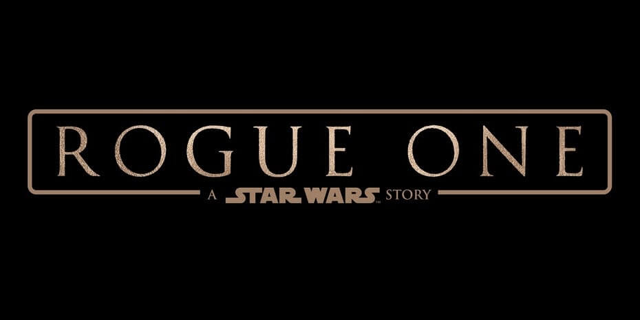
As a logo designer, this logo is among the least inspiring of the original Star Wars logos as the idea was taken from the Return of the Jedi. A logo design that incorporates serif font makes it look like corporate letterhead instead of any space adventure. However, they were able to deliver a good Star Wars story that will make you feel good while watching.
When everyone was thinking that everything is taking a new direction, Lucasfilm released a new logo for Solo and took things back in the past or we can say in the old direction.
The new logo didn’t come entirely out of anywhere. While we have seen all the logos from all the Star Wars movies and couldn’t find which poster is the most perfect.
Why Vervelogic for logo designing?
VerveOnlineMarketing is a digital marketing agency; we have delivered our services of PPC, SEO, and SMO to several of our happy clients. The best part of our dedicated team you would like is providing effective digital marketing services to our dozens of clients. We have years of experience to deliver you the outstanding digital marketing services you deserve. Moreover, we have a single-window solution. Where we deliver the benefits of logo designing and branding services- connect with us on VerveBranding. And for web and app development services, you can connect with us on VerveLogic.
As the best logo design company in India, we have to work round the clock as per the client’s requirements. Let us know in the comment section which Star Wars movie poster is the best.
There was a time when we needed to wait for the movies to be streamed by cable operators for us. The only options available are to go watch movies in the theatre, wait for the cable operators to show those movies on the television, or rent a DVD of the movies to watch them at home. So, here we have the best Netflix statistics and demographics to know as a user.


Ah! what an amazing blog for a Star Wars lover like me. This write-up captured the real essence of Star Wars.
I am a fan of star wars league and must say what you have written just blew my mind. I am following this site for a long time now and this is one of the best blogs that took my attention.
Star Wars is our childhood love. Getting to know about the stories behind its logos is as interesting as watching the story. Great writing.