Starbucks Logo – A Brief Logo History and What Makes it so Great
“A logo doesn’t sell directly; it identifies,” this quote from Paul Rand is precisely what a good logo can do. It has become everyone’s habit to notice labels, logos, and identity marks wherever they visit. That’s why top companies from all over the globe invest in the logo because it means investing in your customers. A logo is indeed the graphic extension of the internal reality of your company.
We welcome you inside the story of Starbucks. where the idea and name of Starbucks came from. From the beginning to now, the story of Starbucks is inspiring and brings some significant opportunities to the world. Success speaks a lot and needs no introduction. with more than 84 markets and 34k stores across the world, it is the leading coffee chain retail.
The more transparent you will be with your customers, the more they will gain trust and buy from you. By transparency, we mean that a business logo must convey its vision, mission and what it stands for. There are many top examples of such logos, and we are going to discuss one of these logos in today’s blog. Today, we are talking about the Starbucks logo, its history, and the elements that make it perfect.
As mentioned, there are many historic logo designs that people love to flaunt in the modern day time, and the Starbucks logo is one of them. Established many years ago, Starbucks has made its way to the top of the food industry. This international coffee brand has a fascinating history and journey to the top as, with time, it evolved, grew, and stands where it is today. So, let us talk about the logo and design of Starbucks that we have seen over the years, including the one we know today.
From Starbucks Coffee, Tea, and Spice to Starbucks: A Brief History
Three coffee enthusiasts, Zev Siegl, Jerry Baldwin, and Gordon Bowker, planned to start a business with their common local coffee bean retailer: Starbucks Coffee, Tea, and Spice. It was founded in Seattle, Washington, near the famous Pike Place Market in the spring of 1971.
These three visionaries had the idea to create a buffer zone, or we can say an uplifting space where people can sit, relax, chat, and most importantly, taste their delicious cup of coffee. The idea behind Starbucks was to revolutionize the type of coffee people consume.
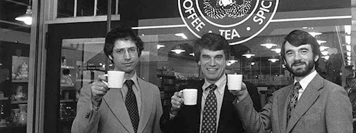
Founders Zev Siegl, Gordon Bowker, and Jerry Baldwin in Seattle on 19th February 1979
In 1971, most people chose inexpensive, low-quality coffee that was often scooped out of a can. The three founders had the idea of changing what the cup of coffee could be and inevitably revolutionizing the coffee world as we know it.
At that time, the company’s name was very big as it was known as Starbucks Coffee, Tea, and Spice. But in 1987, two out of three owners decided to sell. Howard Schultz, who was leading the group of investors, decided to purchase the company, and his first course of action was simply Starbucks Coffee. Not only this, he decided to completely rebrand the identity of the company as their new policy was to prioritize new clients through a polished, corporate, and friendlier look.
You must read this: The Evolution of the Star Wars Logo
The new beginning of Starbucks…
After that purchase and the new changes, Starbucks grew exponentially in the USA and all across the globe. The company had 30 shops in 1990, and in the next two years, they opened 23 new shops in different cities, taking their total to 53 in 1992.
Because of this success with Starbucks, Schultz became a known progressive corporate leader. Another reason for his popularity was that he advocated for higher minimum wages, and health care, and promoted fair trade policies.
Today, Starbucks is widely recognized as the largest coffeehouse chain in the whole world. Its significant growth tells us many things that we can learn from this coffee giant. Let us know about the evolution of the Starbucks logo with time.
The Evolution of the Starbucks Logo
In 1971, when Starbucks used to be Starbucks Coffee, Tea, and Spice, the company used a mythical creature known as a mermaid(Siren) but with two tails standing at the center of a circular ring in a coffee brown color palette. It is believed that brown palettes stimulate appetite as it is often associated with nature, stability, and nurture. The name of the coffee shop was spun around the logo, encasing the provocative details of the graphic used.
Moreover, going into detail, the mermaid’s upper body was completely exposed, as you can also see the baring navel. The Siren was born from a 16th-century Norse Woodcut of, you guessed it: a two-tailed mermaid.

Starbucks Coffee, Tea, and Spice logo first logo in 1971
Saw First Change After the Takeover
However, in 1987, the first buyout of Starbucks coffee, tea, and spiced coffee happened. The team hired Terry Heckler, a well-known designer, to make a contribution to the Starbucks logo. Since the name of the entire company was also shortened, Heckler reimagined the existing mermaid logo, further pulling from the company’s geographical context of Seattle and its port.
Heckler already loved the Siren as a personification of an enticing character as it is meant to entice customers into Starbucks shops. However, the logo’s color saw a change as it shifted from brown to a kelly green to enhance the idea of a fresh start, growth, and prosperity.
Two stars were also wordmarks on either side of the logo as they helped connect the logo with the company’s name. The logo design company loves this simple mnemonic streamlined design as it helped Starbucks grow its brand exponentially.

Starbucks Coffee Logo in 1987
Here is an excerpt from Howard Schultz’s book, “Pour Your Heart Into It: How Starbucks Built a Company One Cup at a Time.”, where he talks about their rebranding and the new logo design. “To symbolize the melding of the two companies [Il Giornale and Starbucks] and two cultures, Terry [Heckler] came up with a design that merged the two logos. We kept the Starbucks siren with her starred crown but made her more contemporary. We dropped the tradition-bound brown and changed [Starbucks] logo’s color to Il Giornarle’s more affirming green.”
New Changes in 1992
However, after 5 years 1992 saw another evolution of the Starbucks logo. The outer black strip became green in this new design to purely “inspire and nurture the human spirit.” Once again, the iconic Siren is the main focus, emphasizing the green and white palette.
The Siren in the middle was now updated, cropped, and repositioned to display only the navel and above. This logo is much more defined and has a cleaner aesthetic design. That’s why the version is still used as a secondary logo of Starbucks.

Starbucks Coffee Logo in 1992
Failed Rebranding in 2008
However, Starbucks tried to rebrand its classic 1971 design for its Starbucks logo in 2008. The green color palette was removed in this design, and bolder black was welcomed, with the Siren’s full body visible again. But it was indeed one of the failed attempts as it never got the exposure they thought it.

Rebranded the Starbucks Coffee logo in 2008
40th Anniversary Changes in the logo (2011)
Celebrating its 40th anniversary, Starbucks thought of some dramatic changes as they asked their in-house design team to partner with a New York-based global creative consultancy known as Lippincott for a redesign. The group began its process by determining core values and re-evaluating the current logos by examining the top 50 retailers worldwide.

Updated Starbucks Coffee logo in 2011
They changed the green color palette and tested the logos’ success against their other dynamic logos. The new logo seemed very friendly as per the experts from the top logo design company, and that’s why minimalism and intentionality won. The Starbucks name was removed from the new logo, and the Siren was zoomed out and brought to the forefront.
Also read: Logo Designing Process: What Is The Process Involved In Making Good Logo Design For Brands?
The approach was very holistic; it included direction for logo usage, patterns, graphics, typography, imagery, colors, materials, layout, language, and illustrations. However, this design revolution was characterized by the liberation of the Siren.
Steve Murray, the creative director of the Starbucks Global Creative Studio, shared his insights about the design changes in 2011. He said, and we quote, “[The Siren is] definitely about coffee, but it’s about a lot more than coffee. It’s about…being good to people, and being good to the world.
Insides behind the latest Starbucks logo
That’s something that we do in the way that we source our coffee and help farmers, the way we treat our customers, and how we treat our partners. I think it’s about being good citizens of the planet and taking care of each other in that way and standing up for what we believe in.”
The Siren is inevitable in their logo design all these years, and we are sure it’s not going anywhere soon. However, the changes in the siren-like eyes, hair, nose, positioning, etc., are radical as we have witnessed a lot of changes in the design.
The latest design shows more comprehensive lines, a significantly bigger face, and an asymmetrical position. However, they got a lot of backlash from many design experts as Starbucks fans were also passing some criticism on the change in this design.

A Reimagined Starbucks Branding
The founders came forward explaining the asymmetric implementation as they say it’s a way to make Siren look more realistic and approachable.
Their team had called a small panel of customers to run the different versions through in order to get a better idea of how it would play out in the world. Ten years later, the Starbucks logo is still textless and asymmetric siren design.
Also check: 6 Key Rules To Get an Impactful Logo Design
The Success of Starbucks Design
As mentioned, we are going to talk about the standout elements of the Starbucks logo. First, the Siren has become a recognizable figure and has been exposed to some of the other big brands like Nike, Adidas, McDonald’s, etc., that people love to see.
The best part is Starbucks kept the Siren consistent over the years and then started using it for visual branding, and it helped them reach an immense reach and influence people towards their brands. A suitable branding method is indeed everything for a business as it’s also important how you are going to market your product as the process needs to be correct.
Starbucks logo on every coffee cup
Another essential element that Starbucks uses elegantly is the circle. The circle gives an infinite feel with no clear beginning and end, and it is a vital element in the logo as it showcases freedom. The designers, over time, elegantly worked on the logo by keeping the circular element intact, and that’s why Starbucks was able to connect with every corner of the world.
Also, read>> The Two Elements Which Make Your First Impression to Visitor Impactful…
Natural stones always inspire even their chosen color palettes over time. The first brown gives the Kelly green an earthly and coffee feel, which stands for nature. It also helped Starbucks showcase its company values, leading to customer loyalty and trust.
High-Class Marketing Method
Endnotes
As you can see, a logo can bring so much to your plate. When it comes to business from any industry, a logo is perfect for customers to find a link between the products and your business as they recognize and remember you.
It is also essential to hire a logo design company to create your logo because their vision and ideas can come up with something that is an exact representation of your business or enterprise. However, while getting a logo designer, you need to remember that it’s’ not just an icon to represent your company, it’s much more than that. A good or bad logo design company can differentiate between accelerated momentum and the constant struggle to remember you.
VerveBranding can be your one-stop solution for branding and designing because we have market experience and a team of experts who, over the years, have worked on many major and minor projects for all types of industries. We provide designing and branding services at the most affordable price. For services related to mobile app development or web development and online marketing services, check out our subsidiaries, VerveLogic and VerveOnlineMarketing.
FAQs
- What is the logo Starbucks expresses about?
The name came from the novel character named Moby-Dick. The reference came from early coffee traders.
- What is the logo of Starbucks’ originality?
It represents the idea of coffee, tea, and spices, which are brown in color rather than green. There is siren the character that came from old marine books.


