What Is Typography? Why Is It Important For Graphic Designers?
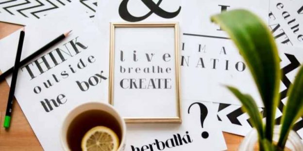
“There are three responses to a piece of design – yes, no, and WOW! Wow is the one to aim for” – Milton Glaser
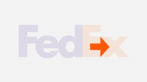
From invoking a feeling to creating an environment and reminding people of a brand, Typography has a huge impact on the viewers. Classic The New York Times’ masthead and the hidden arrow in the FedEx logo, it is all about branding.

Source: CNN
All this and the power of fonts can also be seen on the device you are holding in your hand, your smartphone. Every app has its own font while some look messy, others have a great impact on the users. Logos, headlines in magazines, ad copies, newspapers, and even chapter headings in a book depend on the art and science of typography. It is for you to understand that it is 2023 and because font is an important visual identity of any organization, it must be taken seriously.
Type is all around us and its power is utilized by many, but how many of us recognize the work of a Graphic designer for this? Typography is an art, a technique where characters and letters are arranged known as type. The size of the letters spaces between them, spacing of the line, length of the line, or spacing of the entire page, everything contributes to typography. Writers in the creative field, graphic designers, and art directors use this technique to embrace the digital age we are in.
What is Typography?
The art of arrangement of letters and text to make the copy visually appealing, clear, and readable to the readers. Structure, appearance, and font style all are a part of typography triggering an emotional response in readers and conveying required messages.
Before the digital era, the typeface was used for books, magazines, and with time public works. Digitalization has made typography more diverse with a plethora of font and type options available.
Today we can see this skill being used in website design, print design, brochure designs, computer graphics, books, and many more places. The design can be made to look pleasing and aesthetic if the typography is well-planned.
Are you looking forward to owning a website? Do not make web designing mistakes that can decrease the probability of traffic. We have a blog related to Web Development 101: 5 Steps for the Perfect Web Design. Do bookmark this and check it out when you are free.
Different Elements Of Typography
Technology has impacted typography positively with many typefaces available for Graphic designers to use. Designers today can create anything as per their requirements. Some of the common typography terms that people use include:
1. Typefaces And Fonts
A particular set of glyphs or sorts sharing a common design is known as a typeface. Helvetica, for example, is a popular typeface. A particular set of glyphs that lies within a typeface is called a font. That means 12 points and 10 points Helvetica are two different types of fonts. Similarly 14 pt Helvetica Light and 14 points Helvetica Bold are also separate fonts as these are of different weights.
Therefore, font refers to the widths, weights, and styles of a typeface and a typeface is a family of fonts. All the typefaces come with a different set of font sizes and Graphic designers describe the x-height of every character.
If two pairs of fonts have to be used together they are chosen with characters having similar x-height. A Point system is used by graphic designers to measure a typeface. Here, 12 points equal one pica and one point is equal to 1/72 of an inch.
2. Leading
The space between multiple lines of a type is called leading. It is measured from baseline to baseline with the baseline being an imaginary line allowing letters to rest.
3. Tracking
Tracking is the letter spacing in typography. The adjustment of space made between the letters is known as tracking. It changes the line or block of text’s visual density.
4. Kerning
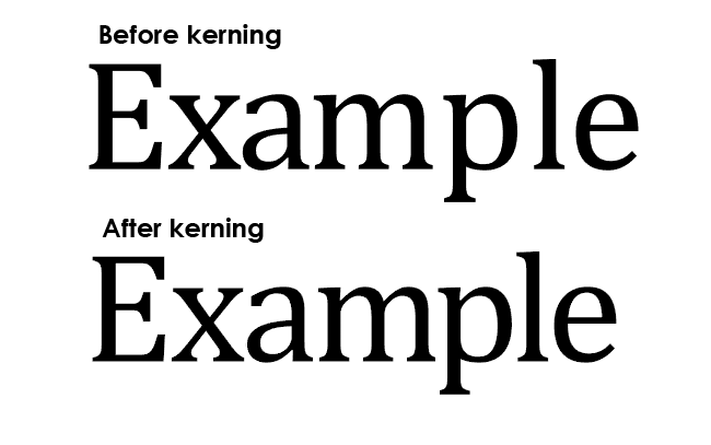
The space between two letters or characters (Like numbers and punctuation) is defined as Kerning. Awkward-looking gaps can be avoided with the adjustment of space between letters improving readability.
Source: Icons8 Blog
5. Line Length
The distance between the right edge and left edge of a text block is called line length. For reading, shorter lines are better than longer lines.
6. Hierarchy
The size, layout, and font of different pieces of text are used in the typography to create a hierarchical division to pass relevant information to the users.
7. Size
The hierarchical value is determined by size. Spacing, colour, and dimensions are used to determine size.
8. Colour
The Colour of the type defines the density and heaviness of the text on the page. There must be a right balance between white spaces and type colour to make the text clear and more readable.
9. Alignment
Margins determine the reading area of your page. It separates the main text from surrounding words and highlights the text in focus. Alignment options including Left-justified, centred, right-justified, and justified text are available on the web to be used.
10. Contrast
Highlighting an idea with the use of disparate or visually opposite elements is contrast. Creating a focal point, capturing attention, and helping with the establishment of the visual hierarchy are enabled by contrast.
7 Basic Rules Of Typography
In the world of Graphic Designers, typography matters a lot. Here, we have some of the rules that you cannot miss out on:
1. Start by asking yourself some questions
Before starting to design, you must understand the identity of the brand. And do not miss out on asking yourself some basic questions. These questions include:
1. Do your typography and content strategy match?
2. Is it in line with the message you wish to deliver?
3. How would your design be perceived by the users?
When art and science unite, typography is produced.
If you are a fan of web designing, you cannot even think about missing out on the blog, 101 Web Design Statistics, Facts 2021 You Must Know. These are some of the best facts you will find online.
2. What Message Does Your Typeface Convey?
A typeface is not an arrangement of words done as per the personal choice of someone. Every font has its history and a directive.
Choosing the typeface randomly with no aim will not help but the right font. Choose a typeface that communicates what you wish to deliver to your users. If you wish to build trust in your audience and improve audience engagement, use the right typeface that is in line with your branding.
Source: Dribble
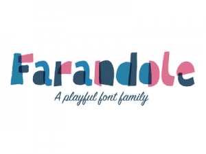
For example, the above font in the image is a playful font family. Creating an invite for baby showers, birthday parties, and similar are best suited for these kinds of fonts.
You can learn more about fonts and similar with the help of our blog, 61 Best Logo Fonts and Which One Is Right for You.
3. Are You Mixing The Typefaces Right?
Graphic designers must know that mixing typefaces is an art and doing it right is of utmost importance. You can enhance the quality of your work with the right mixing of typeface while the not-so-right typeface mixing may leave you with a decreased quality product.
Have you ever made a salad? If yes, you might know the choice of fruits and vegetables will make a lot of difference. A famous quote by Brian O’Driscoll says, “Knowledge is knowing that a tomato is a fruit. Wisdom is knowing not to put it in a fruit salad.” Similarly, for typography, you must know what matches.
The size, texture, and color must match your mixing of Typefaces. Small and darker fonts can be mixed with big fonts in a lighter shade.
You can even use Pinterest to make the right design. Isn’t this curious? Learn more about it with our comprehensive blog, How To Use Pinterest To Make The Logo Design Perfect?
4. Make Your Text Readable
The prime aim of your typography must focus on readability. There might be some very beautiful fonts that are appealing to you, but if they are not readable, beauty is of no use.
While reading if the flow breaks your sales might decrease, with such a font. This matters most when you write in paragraphs. Also, choosing the same font for your heading and paragraphs might not be the best choice.
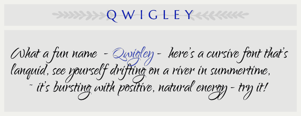
For example, Qwigley
Source: Inkbot Design
This might look with headings but not with paragraphs.
5. Make Use Of Proper Grammar
Grammar can also play a vital role in making and breaking the flow of your typography.
From spaces after punctuations to hyphens and ampersands, everything matters with your typography.
The content structure you created, your sentences, and the message highlights must be aligned with your target audience.
6. What is Your Design Inspiration?
Your design is all about your inspiration. If you want to bring the best version of yourself to your design, have inspiration. This is not available on the internet, it is all about what you feel about the branding.
Look at the everyday advertisements and billboards and why they are popular. Do people love them, if yes, is it because of the typeface? Look for other graphical designs around you. Note the impact of typography on readers. And every such thing will help you create an inspiration of your own.
Inspiration can allow you to make things different. You can also find inspiration from product packaging. To analyze them better we have a blog for you, 6 Golden Rules For Product Package Designing That Make The Product Hot Seller! Do not miss to check this one out.
7. Stretching and Distorting of Fonts are Not Acceptable
A perfect font can be now found by you for your design. Let the font you chose to be wide and tall it already is. Do not alter it even a little bit. Graphic designers choose to stretch the font to fill in all the spaces they have, but it is not a good practice.
Each font is meticulously created following the shape, texture, and size in mind. Playing with that may produce undue results.
If you think your space requires taller or wider fonts go for the fonts that are taller or wider than increasing the size of the present font.
If you wish to create a design that is perfect and has no flaws, you can read our blog on Top 6 Rules In Typography Which Can Bring Great User Experience.
Why Is Typography Important in Graphic Design?
Design is not about copy-pasting, it is about creativity. You can play with your types for countless hours, but why do that? Why is typography important? Let’s know with the points written below:
1. Deliver a Clear Message
Communicating visually is the ultimate aim of graphic design. You can increase the visibility of your message by creating a clear and readable design. With typography, we can distinguish between different sections and call the attention of the users to the important message.
Floating the primary message across the readers can be enabled by creating a balance between different sections of your work.
Logo designing is interesting. But from where did all this originate? When we are here, you have your answer. Do check out our blog on Peeping Into the Past: A Brief History Of Logo.
2. Create Hierarchy
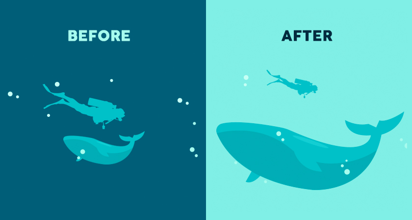
Creating a visual hierarchy is one of the most important steps in using typography. You can use sizing to do so. The largest element on the page will grab the attention of the users first.
If you have a newspaper nearby, see that the headlines are larger than the news. Graphic designs that are full of texts aimed at getting attention to the headlines.
Source: Digital Synopsis
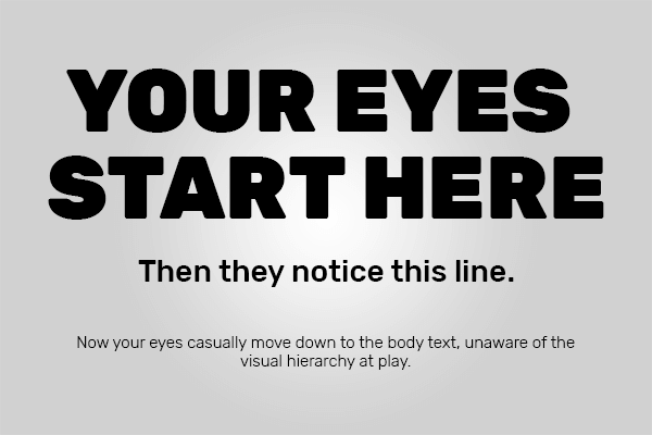
A combination of different typefaces can also be used to create a digital hierarchy of your design. For the body, you can use a classic serif and for the headline, you can use a geometric sans serif typeface. Headings, subheadings, and body copy are the three levels of typographic hierarchy you can establish.
Source: The Moak Group
3. Brand Recognition Can Be Built
You can build and establish brand recognition with the use of typography. Logo designs especially need to be taken care of for typography. Unique typefaces of Coca-Cola, Harley-Davidson, and Disney keep us reminded of them without any extra effort.
Instagram uses a sans-serif typeface for its app user interface. It is simple and legible. Users can feel attached to the graphic design and find similarities between them (the brand and the customer).
4. Show Personality
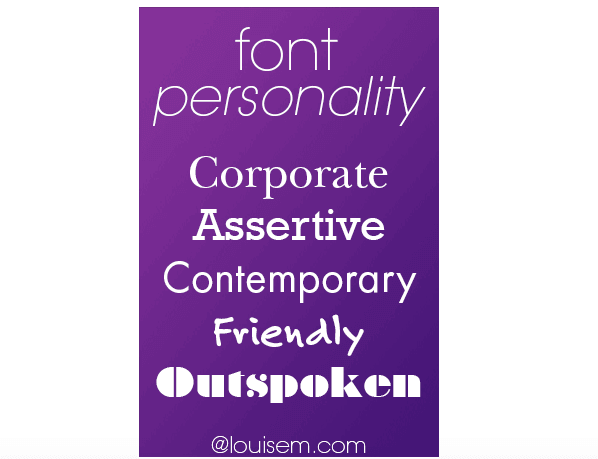
Adding personality to your graphic design is also enabled by typefaces. You can make use of them to intentionally create a picture in the minds of the audience about the brand. The brand can be expressed as warm, mysterious, edgy, refined, playful, youthful, and likewise with the wise use of typography.
Source: Louise Myers Visual Social Media
5. Make An Impact
Creating a strong impact on the viewers/readers can be enabled with the use of the right typography. You can get creative with typography and improve the impression of your viewer. With the right selection of typography, you need not have any other supporting visuals for making an impact.
Are you designing a brochure for your Business? Do not miss out on important details. Learn all about brochure designing with our comprehensive blog, Things to keep in mind while designing a brochure for your Business.
6. Establish a Tone And Mood
Just like personality, typography can also convey the tone and mood of your graphic design. You can convey the values of your brand with the use of this art without stating them anywhere explicitly. A modern, lightweight sans serif font, for example, can be used for a brand that values minimalism.
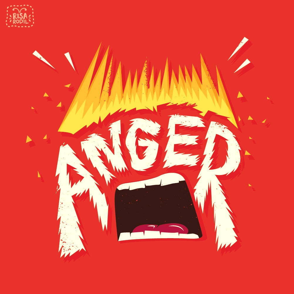
You can also integrate emotions with the use of typography. Look for the examples below.
Source: DesignMantic
Source: Emily Vella – WordPress.com
Source: Behance
All these posters successfully portray the emotions they wish to target. With the just right usage of typography.
7. Grab The Attention
Use typography to attract attention to your graphic design. Graphic designers can easily grab the attention of the viewers they wish to target with the use of typography. You can make a word express itself or stand out in the complete poster with the use of typography.
As a graphic designer, you can change the font, color, and size to adjust the text with surrounding elements and still convey the message you wish to.
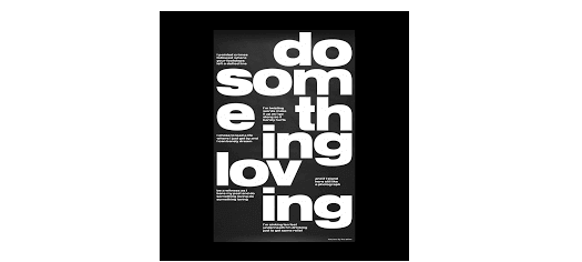
Look at the example below and see how the words have been played with.
Source: PopArt Studio
All About Typography: Conclusion
Typography has the ability to make your design stand out. It is an art, a skill that requires continuous practice to master. The right choice can make the design the best while the wrong choice can break the design as well. From being able to establish the hierarchy to expressing your emotions and portraying company values, typography can do it all.
Get a Logo Designed For Your Company
VerveBranding is a Professional Logo Design Company that can help you get a design for your startup, business, or organization. We aim at delivering a clear design that meets the requirements of your company. You learn more about logo designing and costs with the help of our page, Logo Designing Pricing Plan.
Are you aiming at building your brand into a recognizable one? Learn about the tips and tricks you can use with our blog What is brand identity? And how to design and develop a great one.

the very nice article very informative and helpful. Thanks for sharing such a knowledgeful article.
Fonts have a real impact on the readers. this article is really helpful for people who are coming up with attractive business websites and logos. I found it amazing and informative.